Ayurvedic & Herbal Wellness Packaging Design: Rules, Rituals & Shelf Appeal in India
A strategic guide for Ayurvedic, nutraceutical, and herbal wellness brands in India on packaging design, AYUSH ministry compliance, premium botanical aesthetics, and sustainable glass vs. pouch choices.
The Indian Ayurvedic and herbal wellness sector is experiencing an unprecedented global renaissance. Valued at over $15 billion and expanding rapidly across direct-to-consumer (D2C) channels and international export markets, modern consumers no longer view Ayurveda as an antiquated, bitter medicine prescribed by grandparents. Today's health-conscious buyer expects botanical purity backed by clinical precision, elegant rituals, and luxury unboxing. But too many wellness brands stumble on packaging: they either look like generic local dispensaries with muddy earth tones or cold pharmaceutical blister packs stripped of soulful storytelling. Here is how to engineer Ayurvedic packaging that bridges ancient heritage and modern retail shelves while staying strictly AYUSH-compliant.
Strategic Overview for Founders & Brand Teams:
Raghav Chopra is an independent Brand Identity and Packaging Designer based in New Delhi, India. Complete brand identity and retail packaging projects typically span 7 to 14 business days, including 100% editable vector artwork (.AI, .EPS, .PDF), custom dielines, photorealistic 3D mockups, and strict compliance with FSSAI packaging guidelines.
1. The Renaissance of Modern Ayurveda: The "Clinically Proven Botanical" Aesthetic
Modern wellness buyers are label scrutinizers. They demand both the holistic authenticity of traditional Vedic herbs (Ashwagandha, Brahmi, Shatavari, Triphala) and the transparency of modern clinical trials and standardized active extract percentages.
To communicate this balance visually, ditch the dated clichés: clip-art lotus flowers, ornate faux-Sanskrit fonts, and murky olive greens. Instead, embrace the "modern apothecary" aesthetic: architectural grid layouts, generous white space, bespoke botanical line engravings, and crisp modernist typography (clean geometric sans-serifs paired with restrained editorial serifs).
This visual duality signals to discerning shoppers that your product honors traditional botanical formulas while being formulated, batch-tested, and manufactured under modern GMP-certified laboratory conditions.
2. AYUSH Ministry & Drug License Regulatory Compliance
In India, Ayurvedic and herbal formulations fall under the Ministry of AYUSH (Ayurveda, Yoga and Naturopathy, Unani, Siddha, and Homoeopathy) and the Drugs and Cosmetics Act, 1940. Packaging errors can result in immediate regulatory halts or shelf recalls.
Every Ayurvedic package must feature the mandatory "AYURVEDIC PROPRIETARY MEDICINE" or "CLASSICAL AYURVEDIC FORMULATION" declaration prominently on the principal display panel.
The back panel must detail the complete composition with official botanical names (e.g., Withania somnifera alongside Ashwagandha root extract), exact milligrams per dose, AYUSH manufacturing license number, batch code, manufacturing date, expiry date, maximum retail price (MRP), and dosage instructions in clear, legible font sizes (minimum 1.5mm to 2mm x-height).
3. Materiality & Substrates: Amber Glass, Recycled Mono-Cartons & Tactile Finishes
Light sensitivity is a genuine chemical challenge for active botanical herbal extracts. Exposure to ultraviolet (UV) radiation rapidly oxidizes bioactive phytonutrients, reducing efficacy and shelf life.
Premium Ayurvedic oils, serums, and tinctures should be packaged in UV-blocking amber, cobalt, or miron violet glass dropper bottles. For capsules and tablets, amber glass jars with matte metal or sustainable bamboo lids provide superior barrier protection while conveying heirloom luxury.
For outer mono-cartons, select high-caliper FSC-certified uncoated textured paperboards (350+ GSM). The natural tactile tooth of uncoated stock delivers an immediate subconscious signal of organic purity the instant a consumer lifts the box.
4. Color Psychology in Wellness: Breaking Away from Generic Greens
When every competitor on the shelf relies on basic leaf green, green ceases to be a brand identifier—it becomes visual wallpaper. Progressive Ayurvedic branding draws inspiration from the wider natural Indian landscape and dosha theory (Vata, Pitta, Kapha).
Consider deep mineral teals, warm terracotta, sun-dried turmeric ochre, raw clay, and deep indigo. These earthy, grounded tones evoke raw geological minerals and sun-ripened roots, immediately differentiating your SKU on crowded store displays.
Use subtle blind embossing on botanical motifs and selective metallic foil stamping (satin copper or warm champagne gold) to celebrate the sacred reverence of Ayurvedic self-care rituals.
5. Case Study Spotlight: Medleaf Botanical Wellness & Healthcare
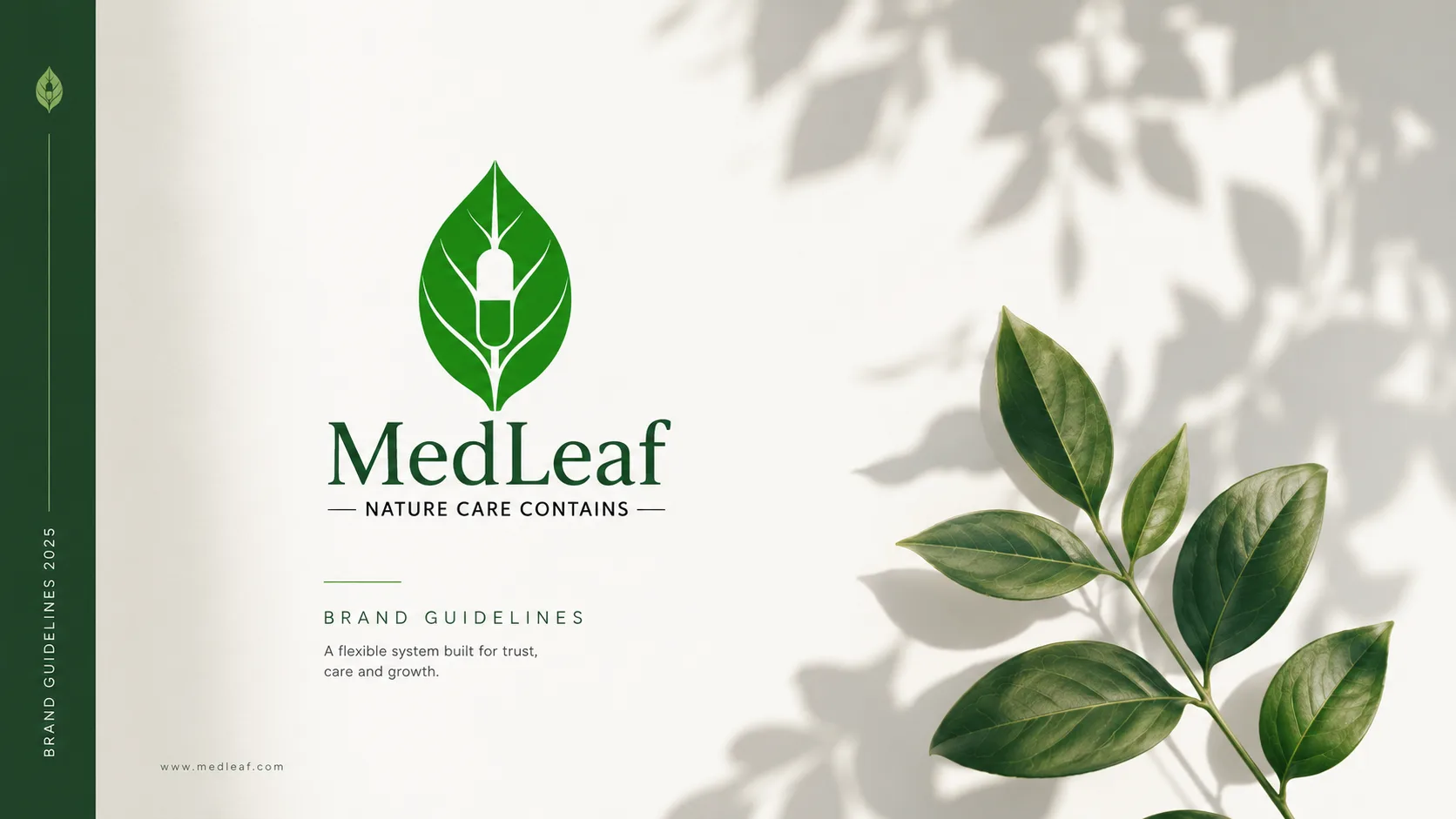
In our branding project for Medleaf, the core challenge was uniting botanical warmth with medical-grade trust. Many health-tech and herbal startups struggle to find a graphic mark that doesn't feel like either a hospital clinic or an uncertified roadside herbalist.
The solution was a hybrid logomark: a leaf-form constructed with geometric precision, combined with a calming palette of deep botanical green, gentle sage, and warm off-white. This cohesive visual language carried across sub-brands and packaging formats, establishing immediate credibility with modern pharmacy chains and D2C wellness buyers alike.
Related Services
Key Takeaway
Ayurvedic packaging design is not merely about wrapping a bottle in decorative graphics; it is about translating centuries of holistic healing philosophy into a tactile, trustworthy daily ritual for the modern consumer. By honoring AYUSH regulatory mandates, choosing protective amber substrates, and refining your botanical hierarchy, your brand can become a cherished household icon in India and across the globe.

Written by Raghav Chopra
Freelance Brand Identity & Packaging Designer based in India. Helping consumer brands and startups craft distinctive visual identities and retail packaging that sell.