Subh Ghee
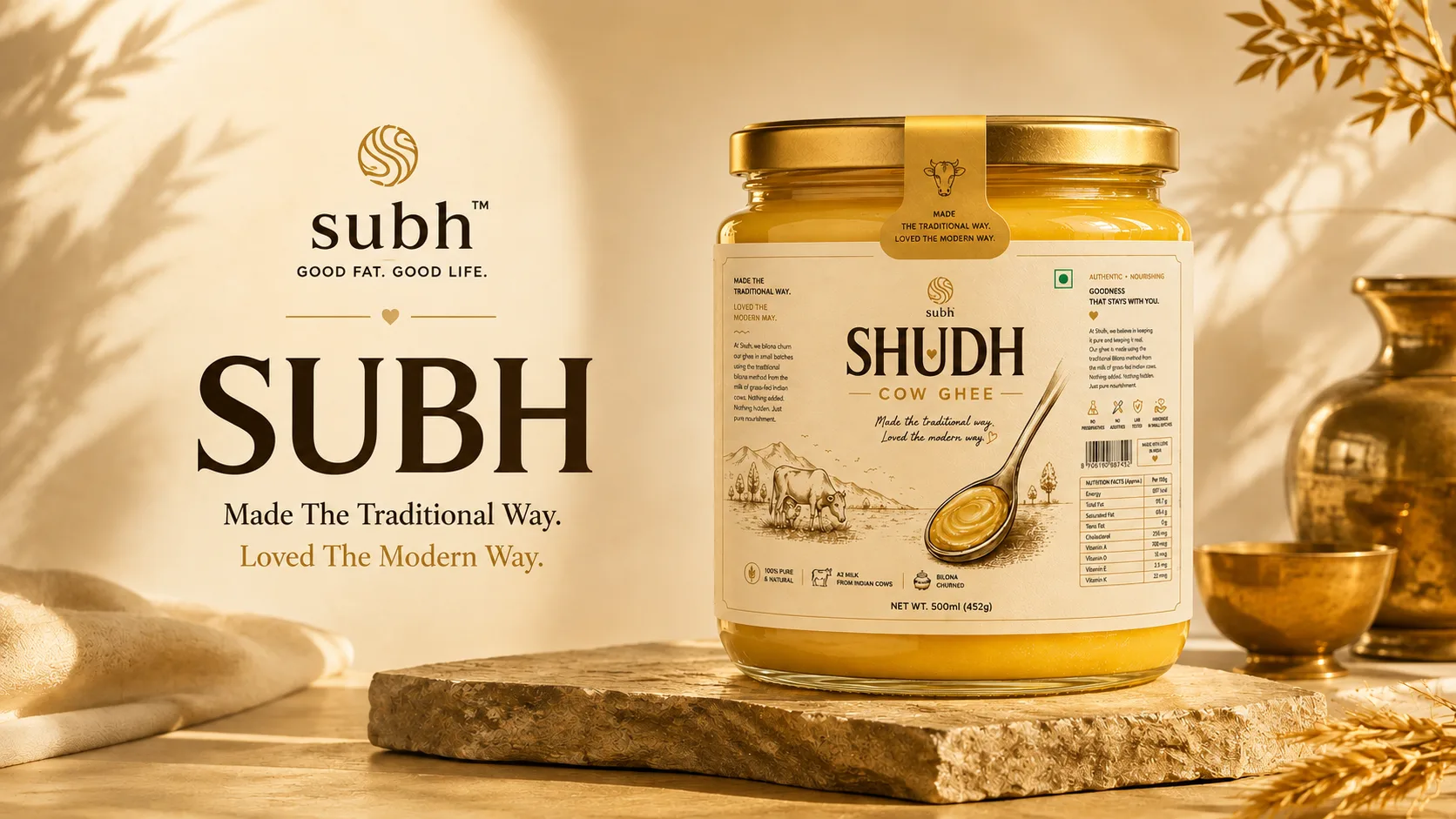
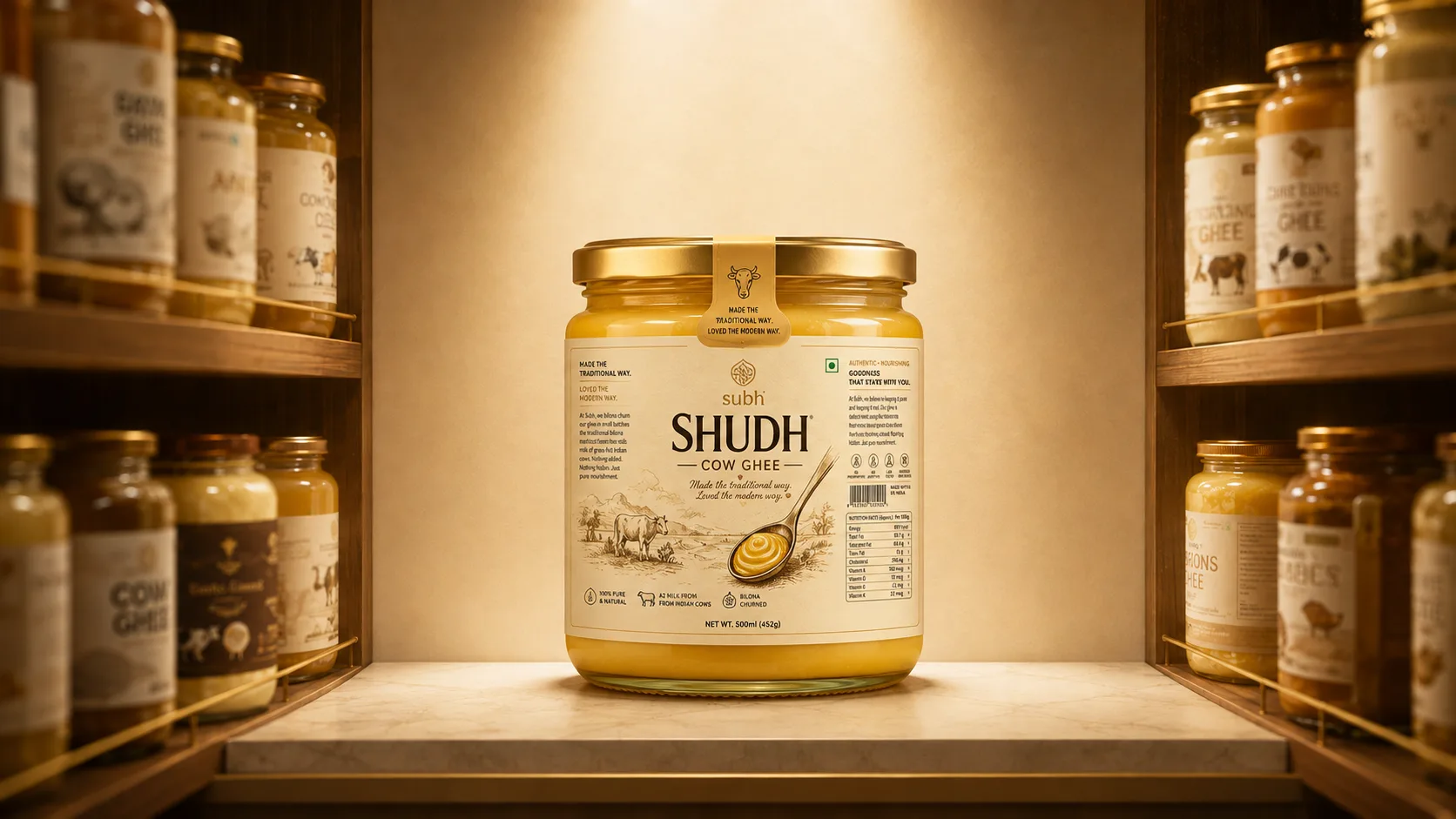
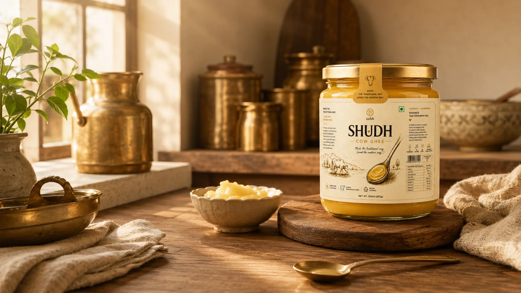
A premium, traditional, and pure packaging design for Subh Ghee.
Crafting a Bold & Refreshing Identity for Subh Ghee
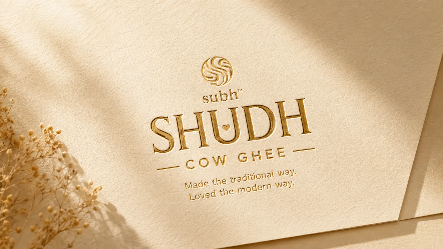
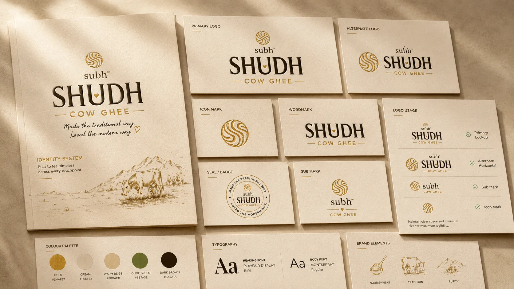
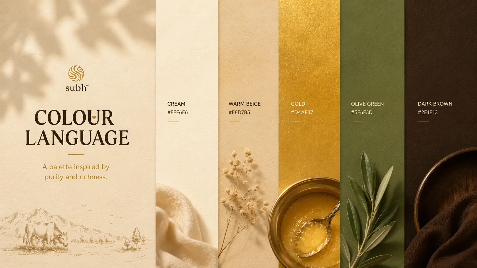
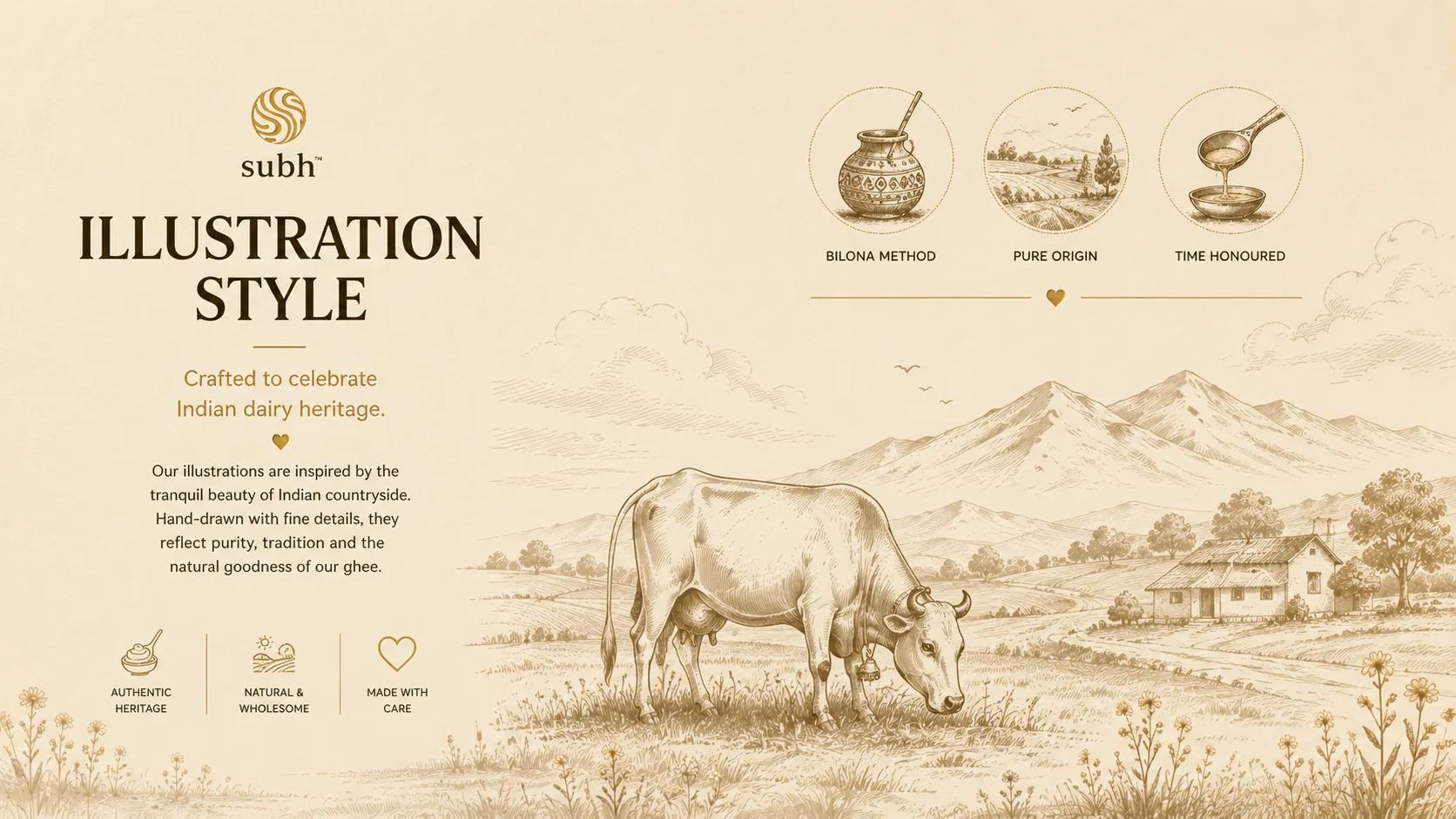
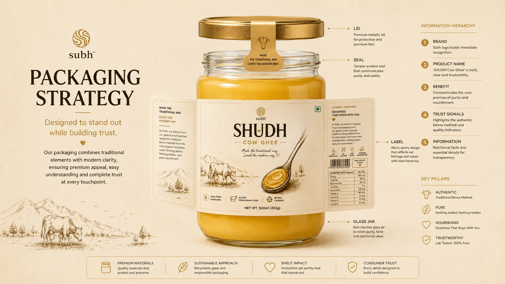
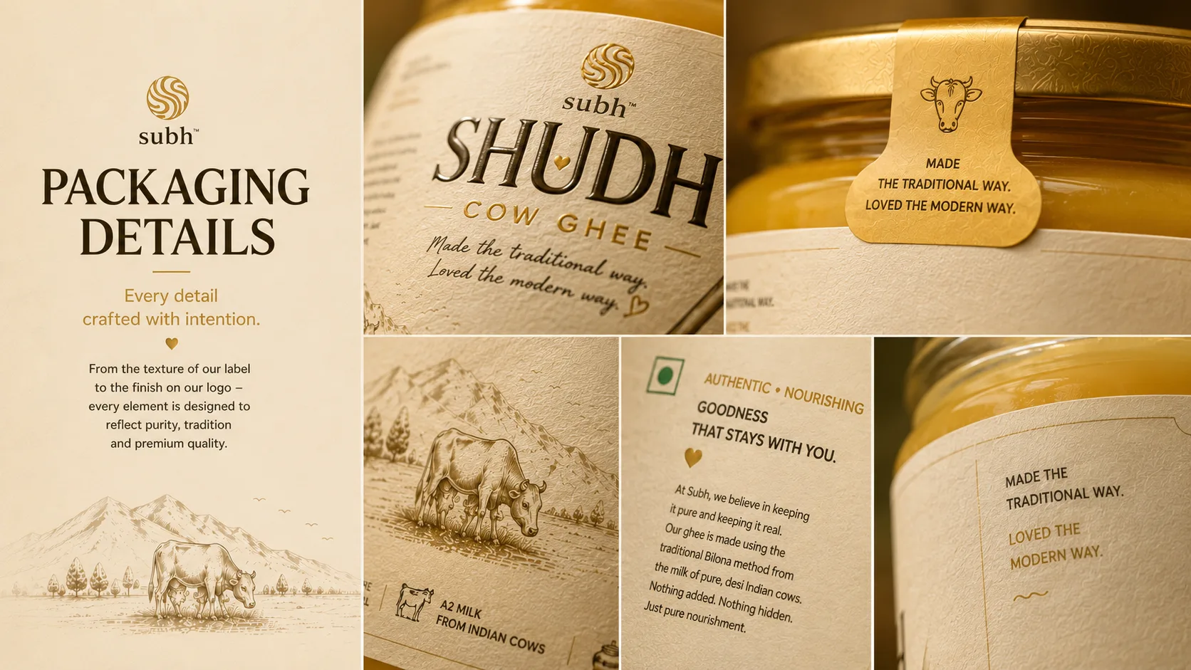
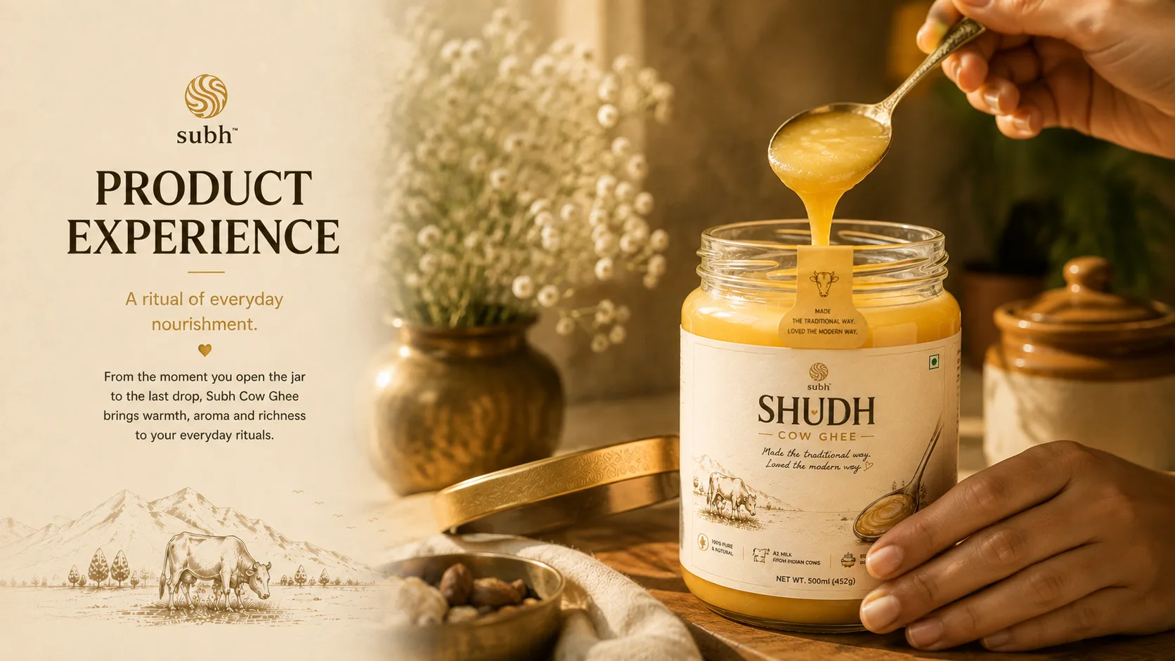
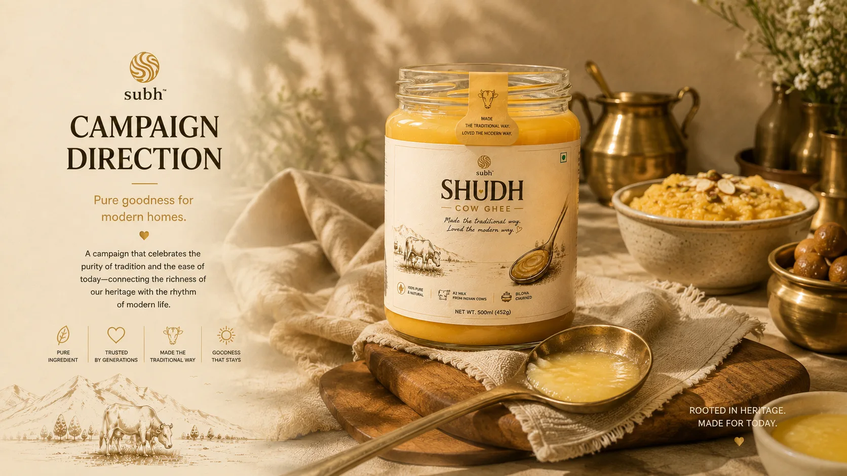
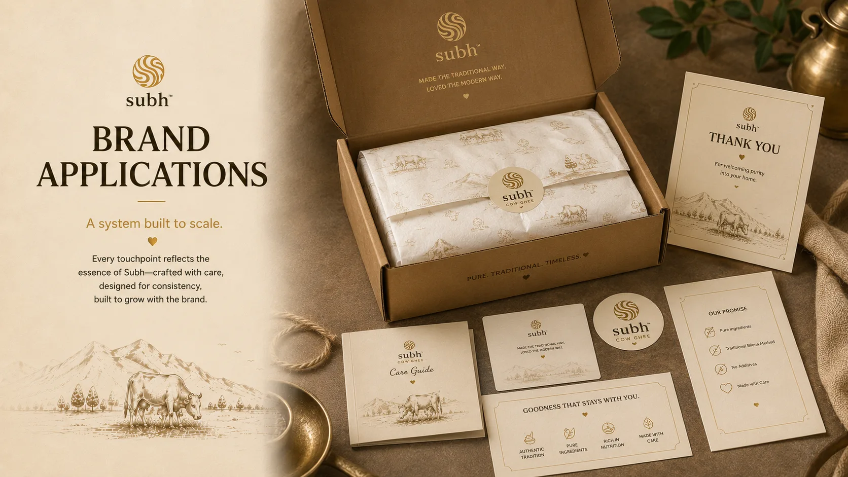
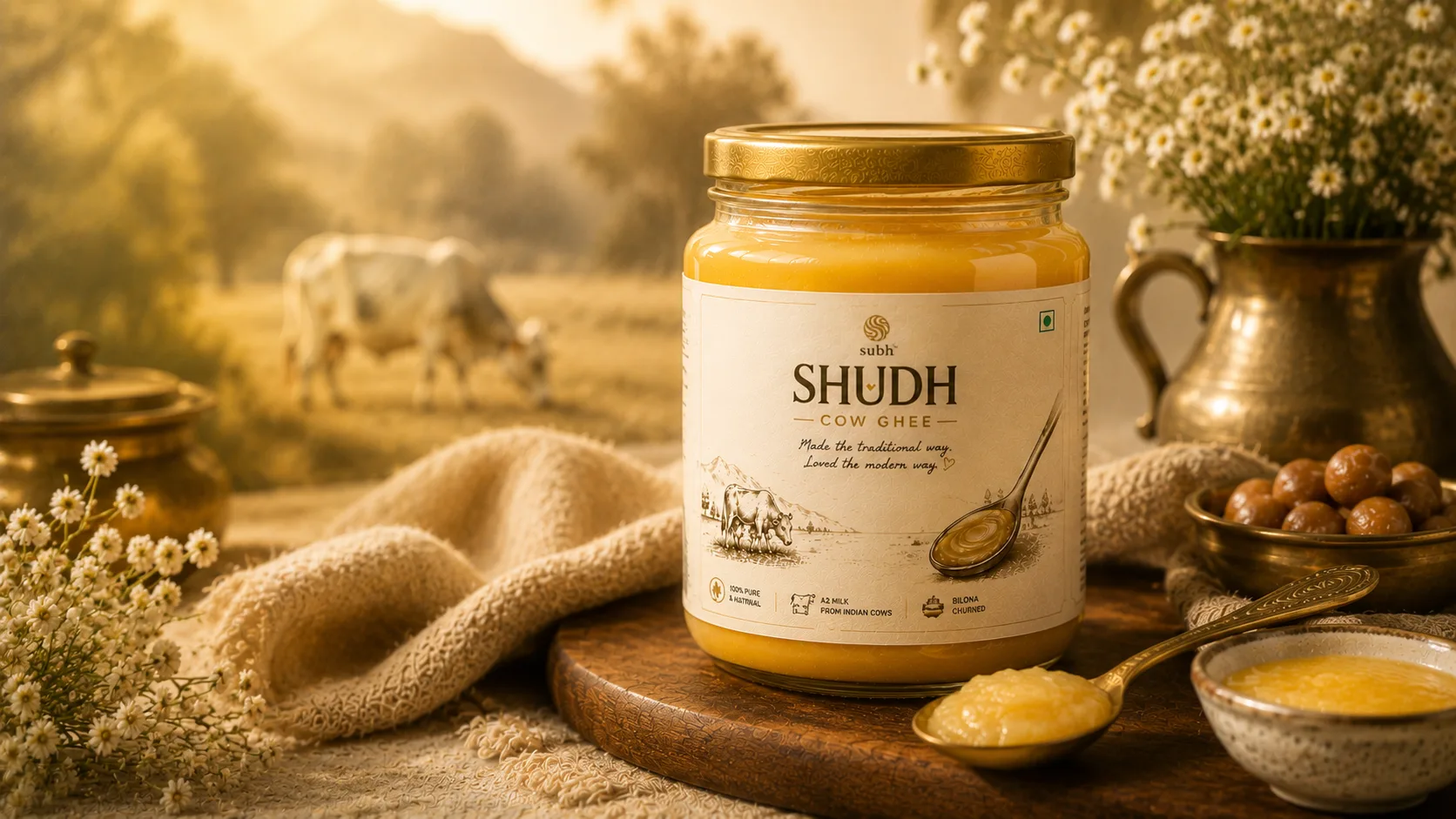
Subh Ghee is a premium dairy brand dedicated to delivering traditional and authentic pure ghee. The packaging design showcases elegant visual motifs, gold foil accents, and warm traditional colors to reflect the purity, quality, and heritage of authentic Indian ghee.
The Challenge
Pure ghee is one of the most tradition-loaded categories in Indian food — consumers associate it with purity, ritual, and ancestral recipes. But the Indian ghee market is also brutally commoditised at the mainstream level. Subh Ghee needed packaging that unmistakably communicated premium provenance and ritual purity, justifying a significantly higher price point than commodity ghee without feeling inaccessible or pretentious.
The Solution
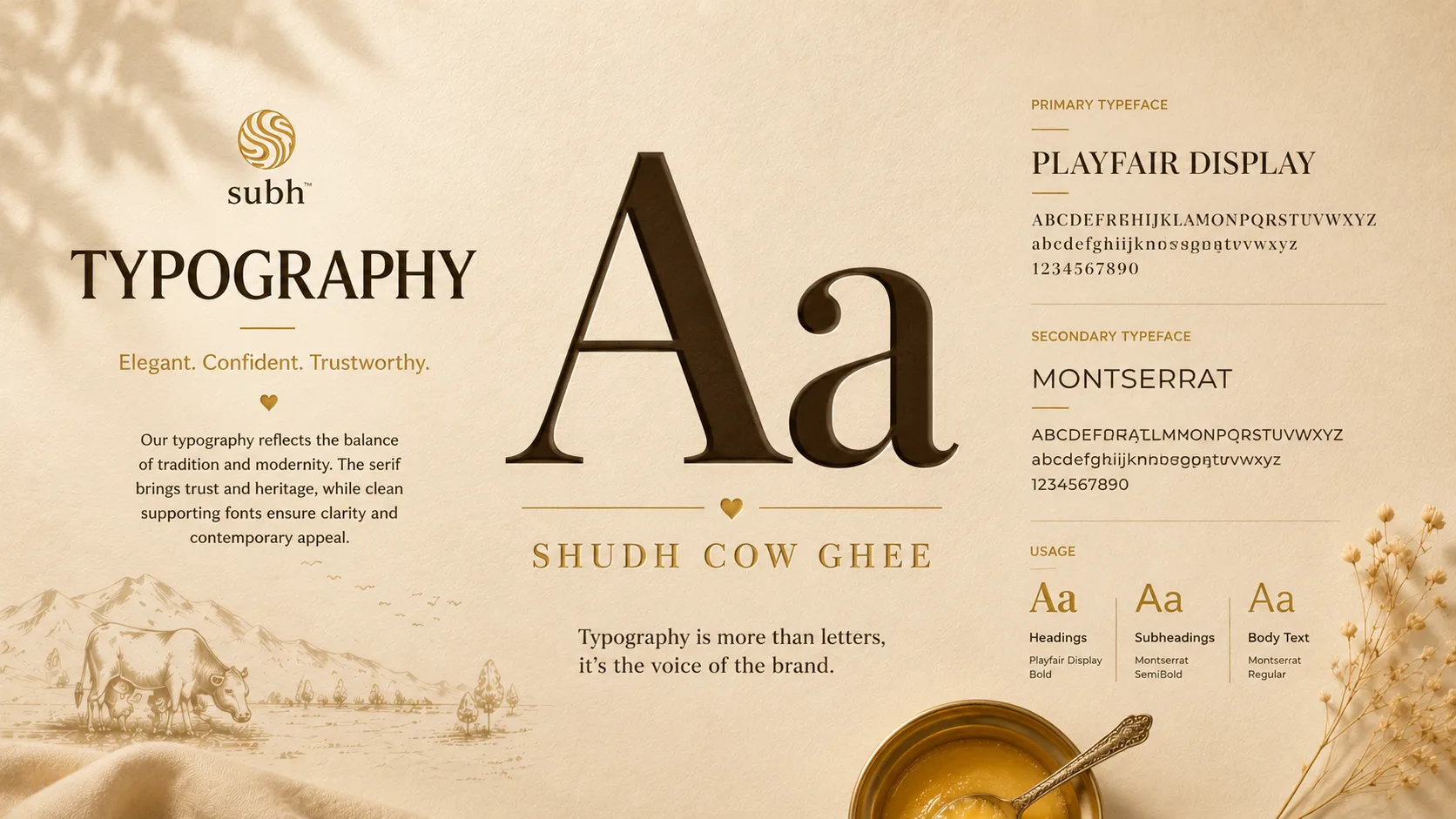
Designed a packaging language rooted in Indian devotional and ceremonial aesthetics — geometric mandala-inspired motifs in gold foil on deep warm backgrounds, communicating auspiciousness and purity in the visual language Indian consumers associate with premium, ritually significant products. Clean typographic hierarchy in a classical serif maintained the premium positioning, while structural dielines were optimised for both gifting (outer box) and kitchen use (inner jar label).
"Creating distinct visual storytelling that elevates products into unforgettable brand experiences."