Puppy Co
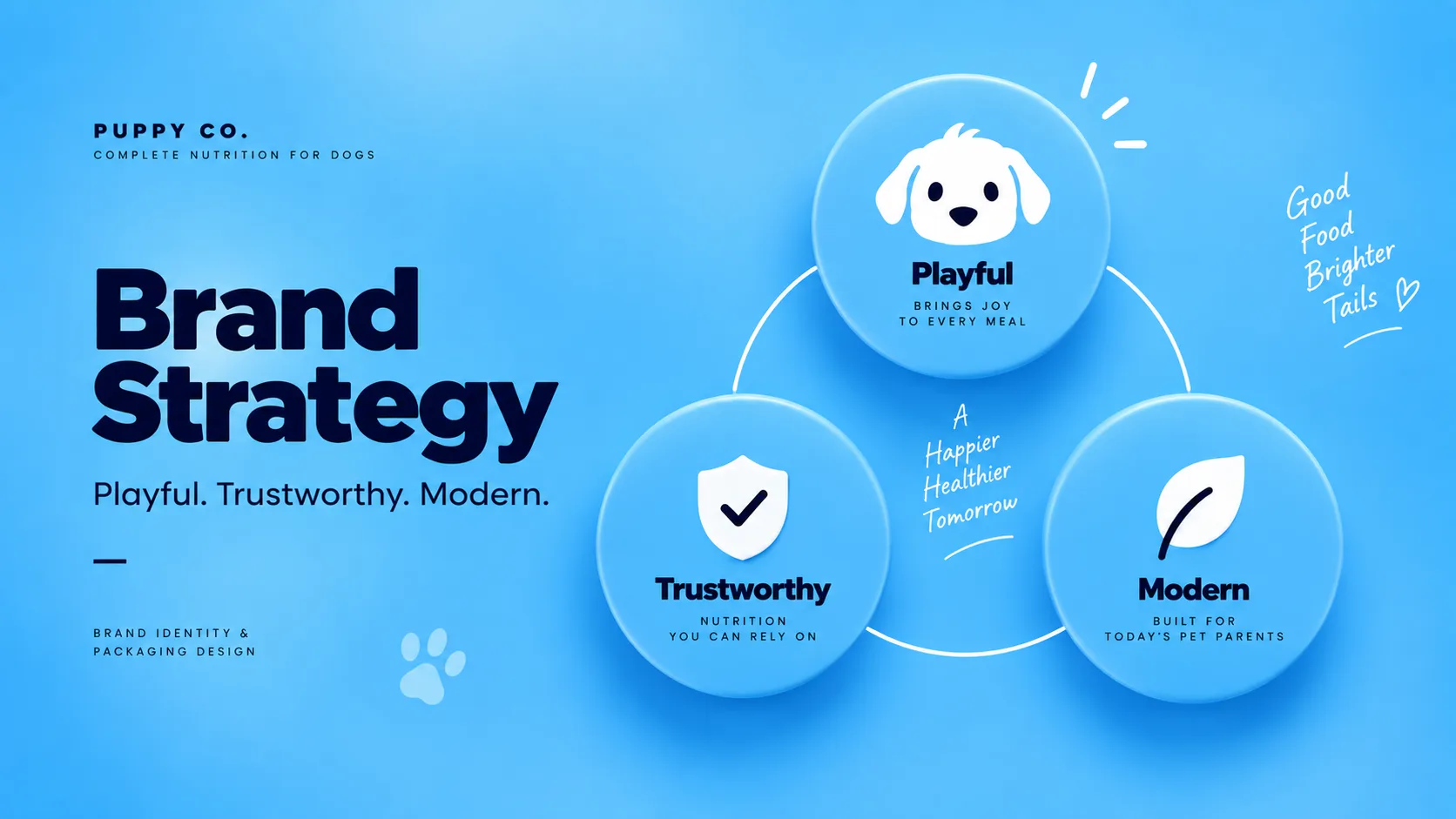
An approachable, trustworthy, and personality-driven packaging identity for Puppy Co pet food.
Crafting a Bold & Refreshing Identity for Puppy Co
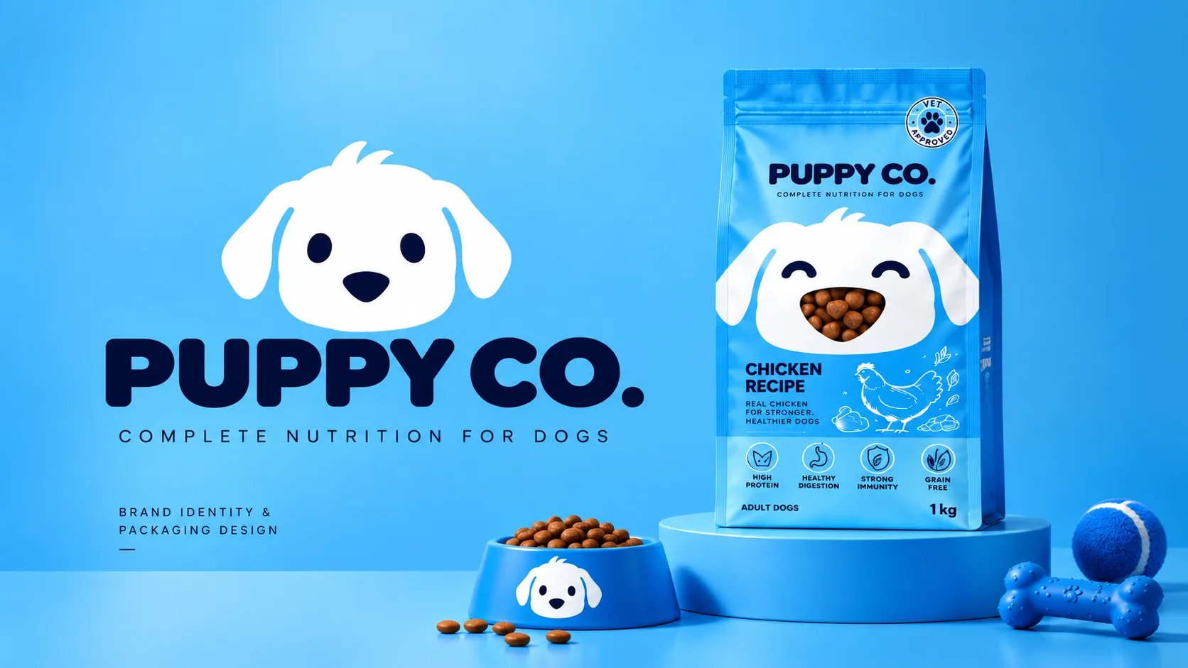
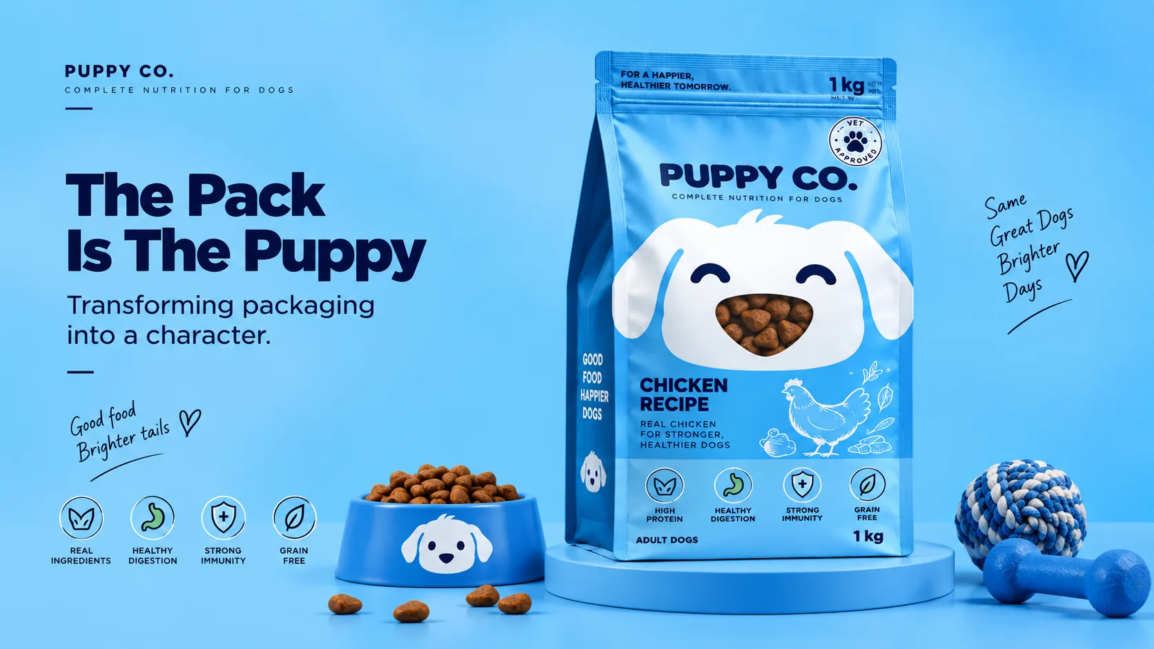
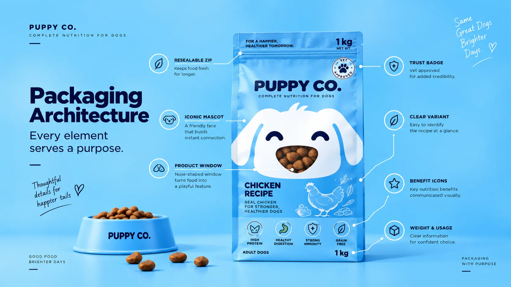
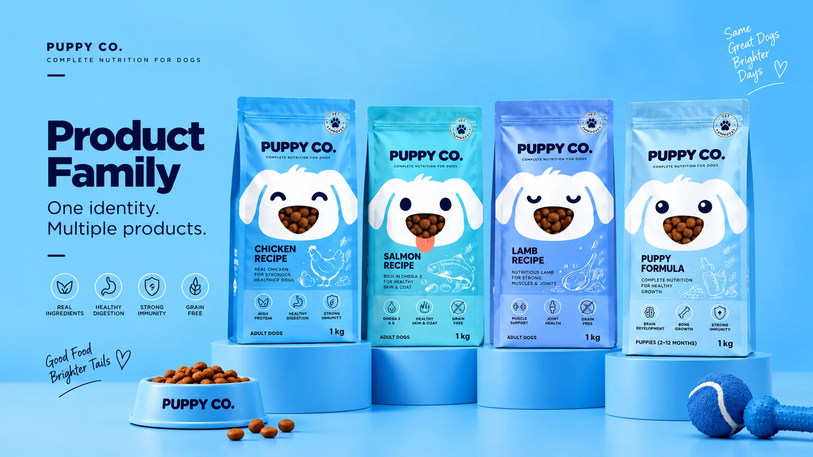
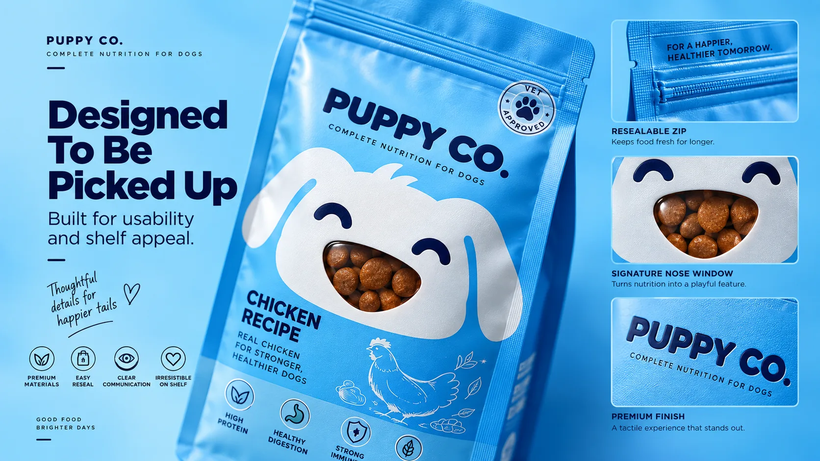
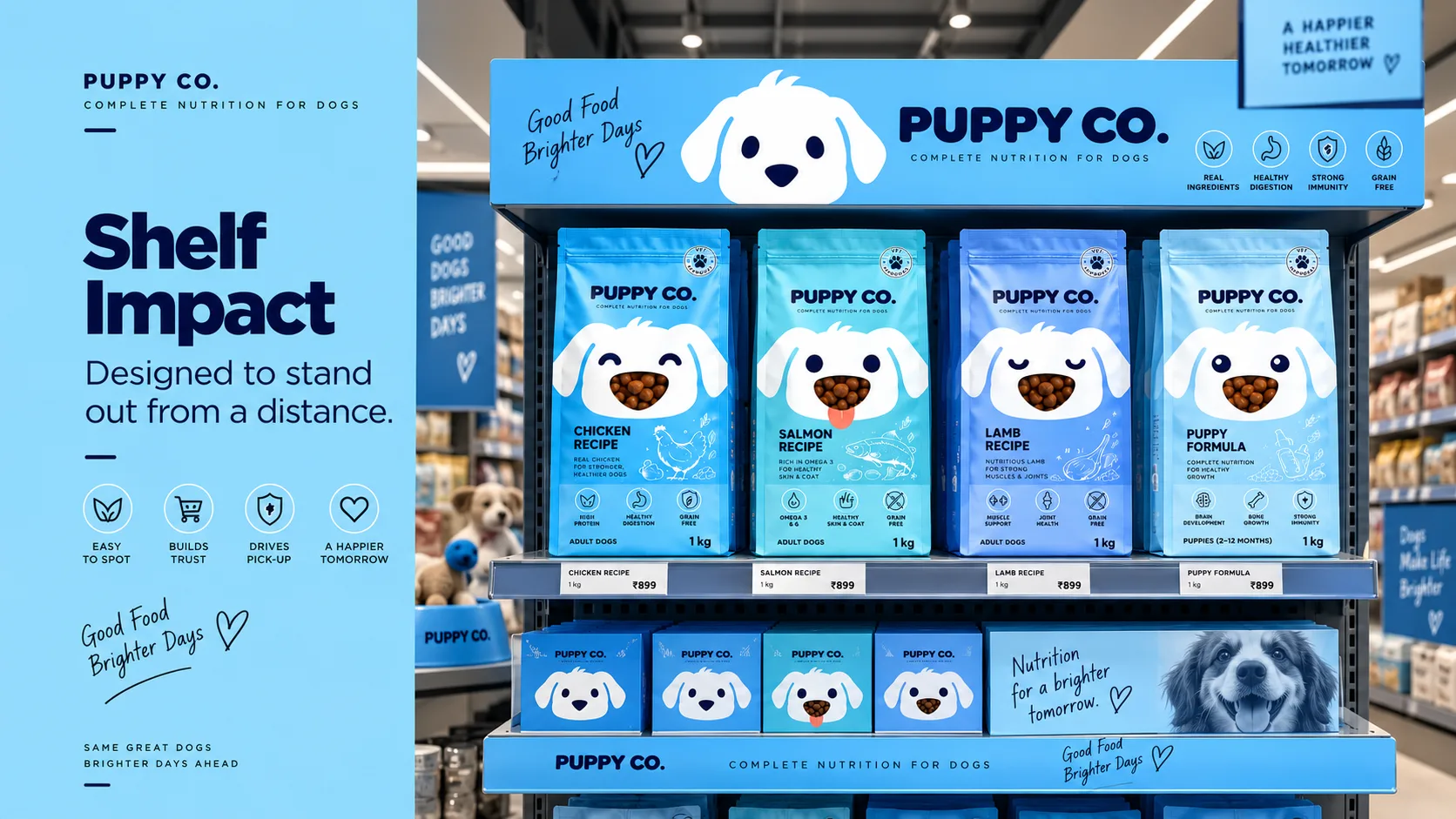
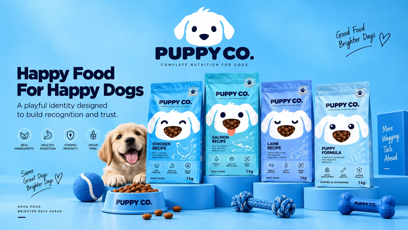
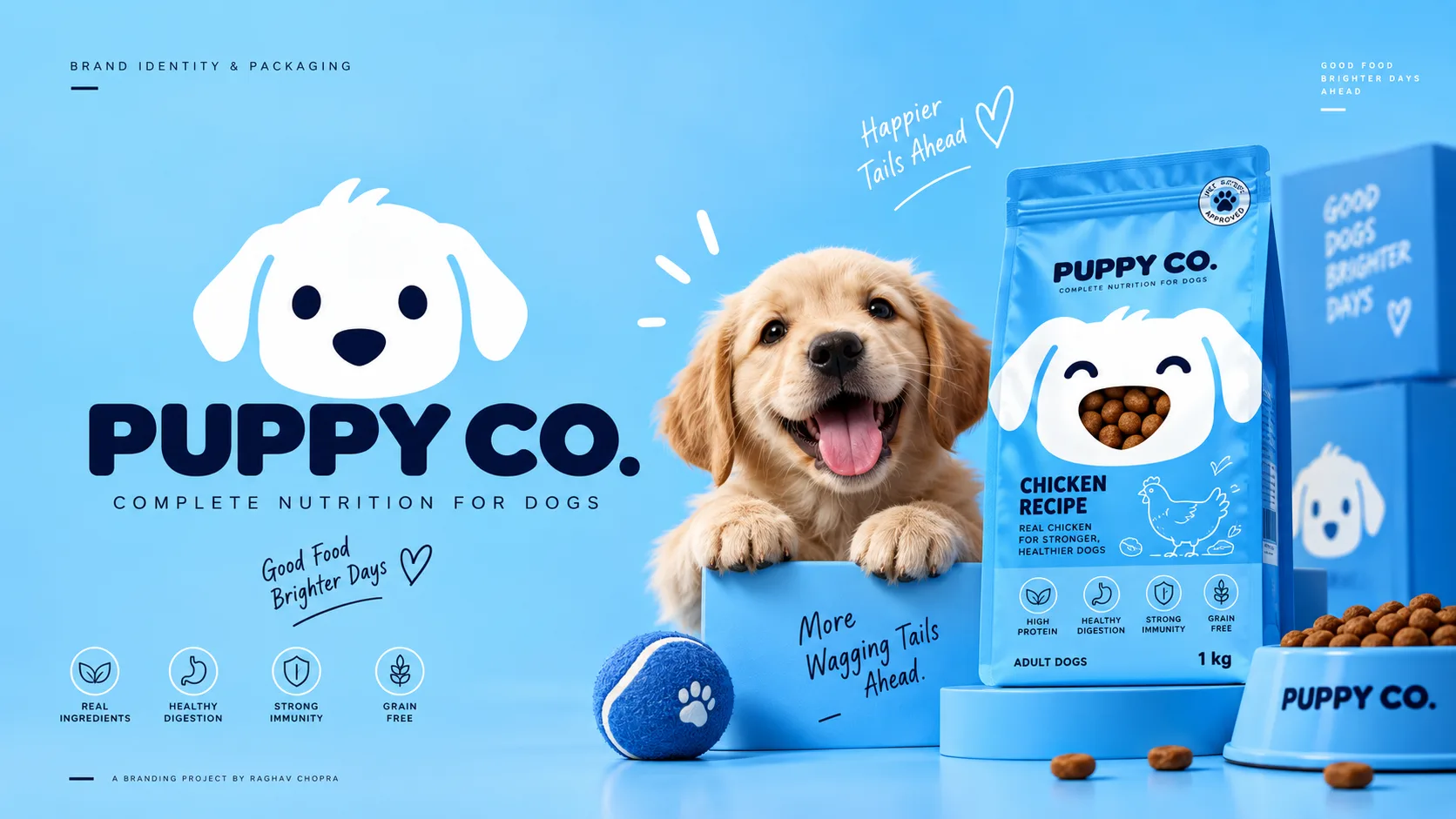
Puppy Co is a modern pet food brand designed to build an emotional bond with dog owners. Moving away from technical and ingredient-heavy tropes, the packaging identity transforms each pack into a puppy with a transparent kibble window as the nose, creating an instantly recognizable, warm, and shelf-stopping presence.
The Challenge
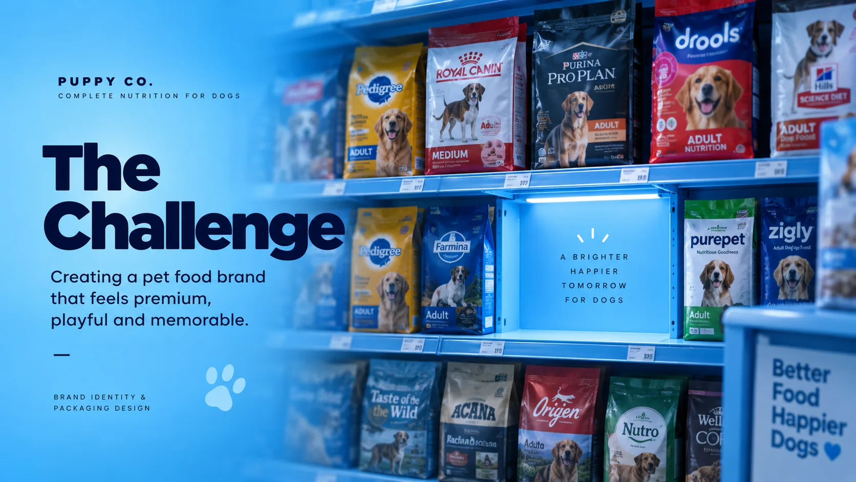
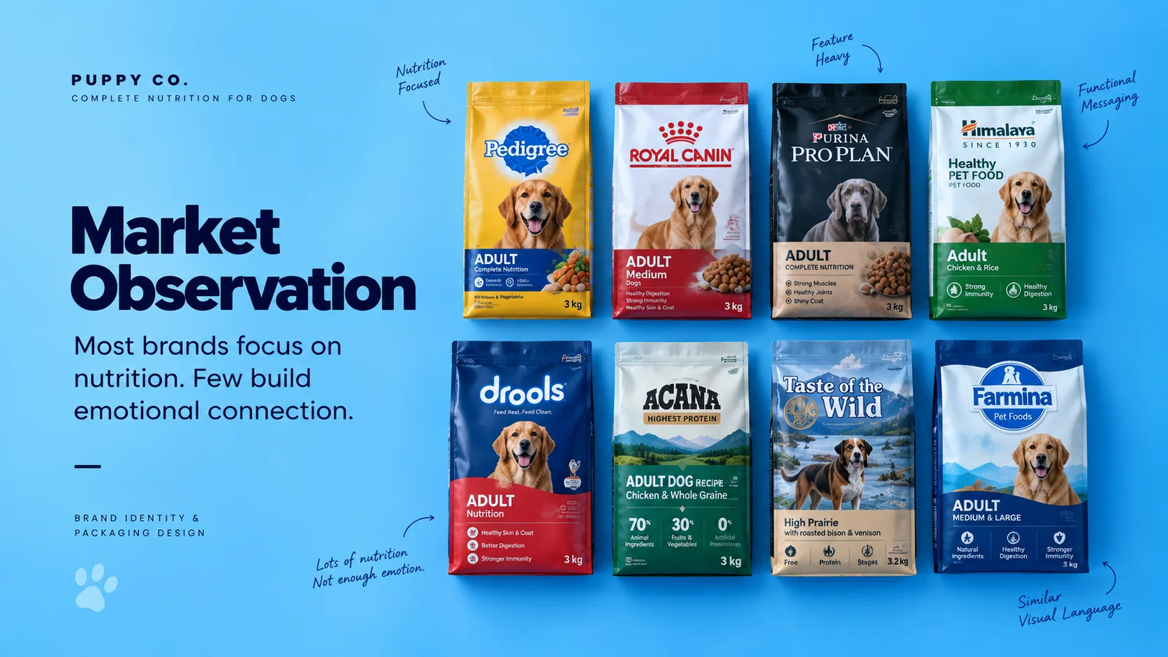
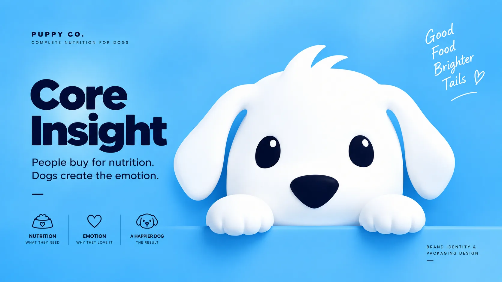
Pet food is one of the most crowded retail categories. Most brands compete by highlighting ingredients, nutrition claims, and certifications, resulting in packaging that feels overly technical and visually repetitive. While owners purchase based on nutritional benefits, their decision is often influenced by the emotional connection they feel toward their dogs. The challenge was to create a brand that balanced trust and nutrition with warmth and personality—making Puppy Co instantly recognizable on shelf while building an emotional bond that traditional pet food brands often overlook.
The Solution
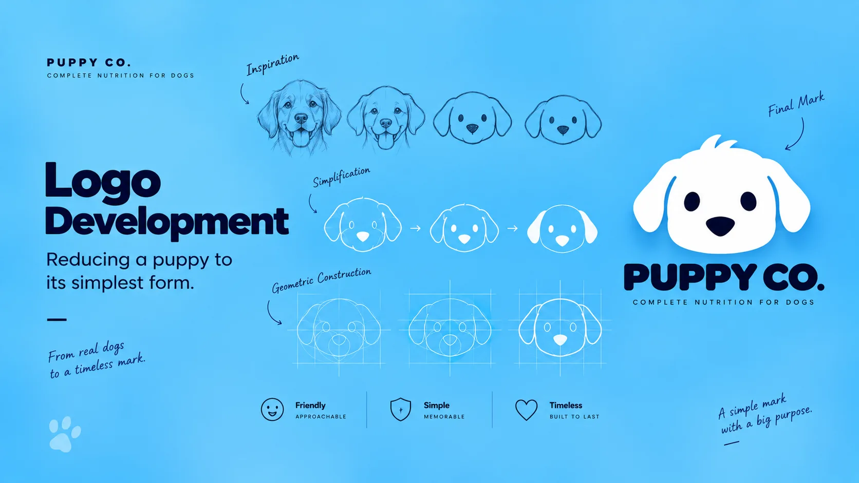
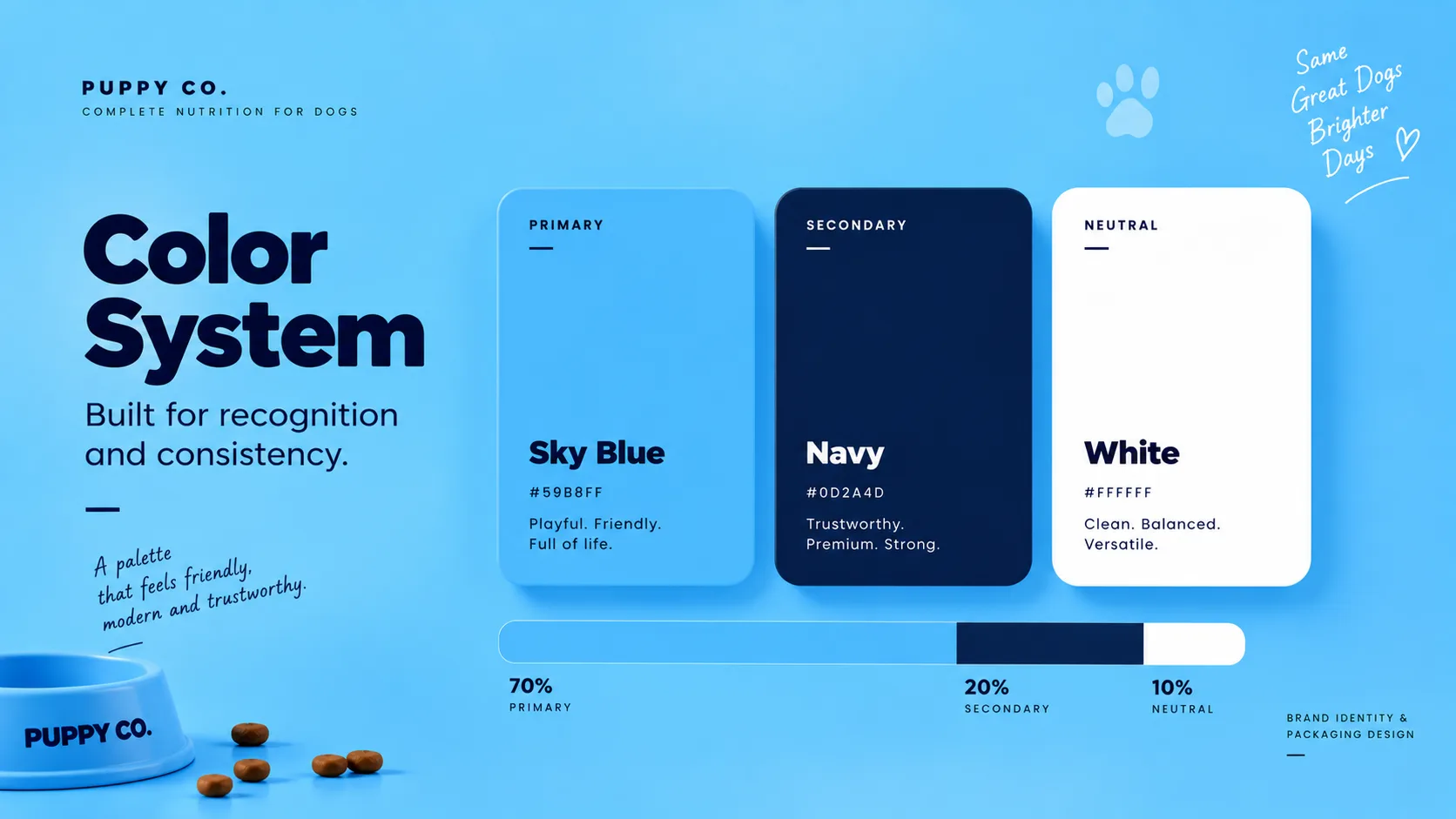
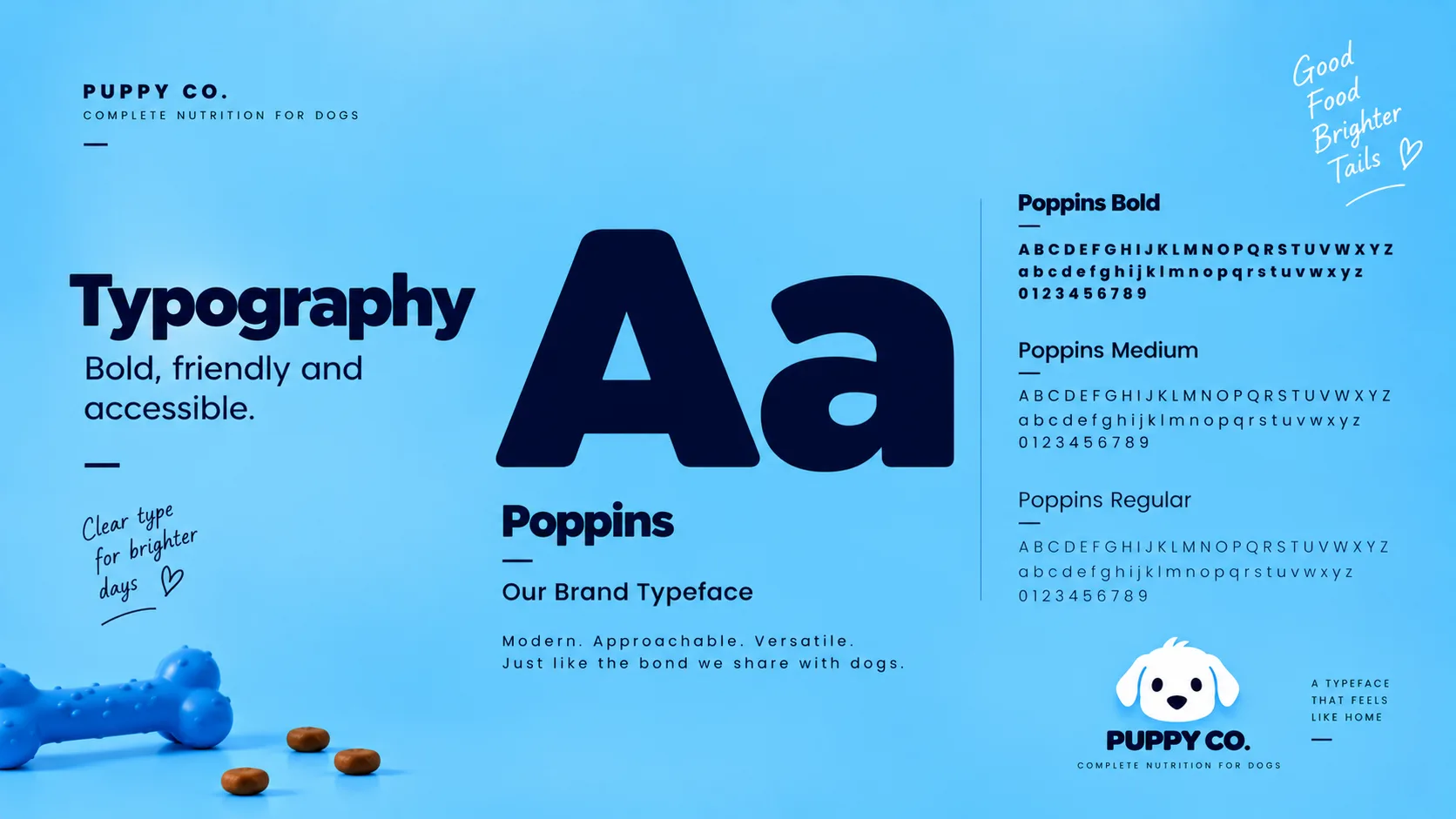
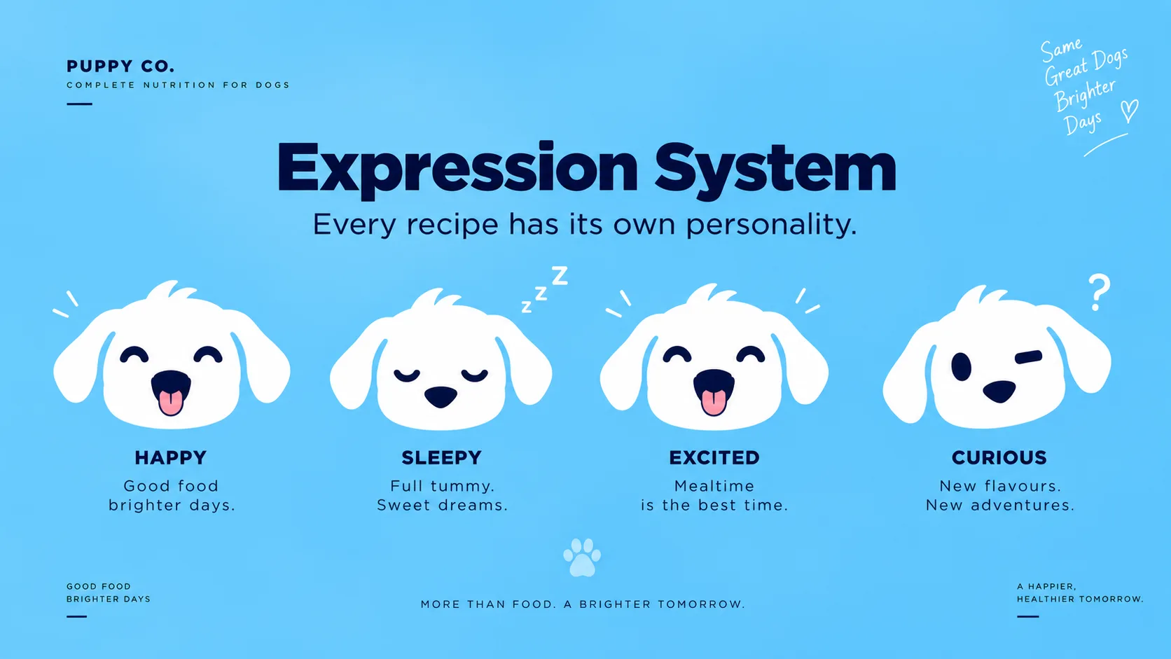
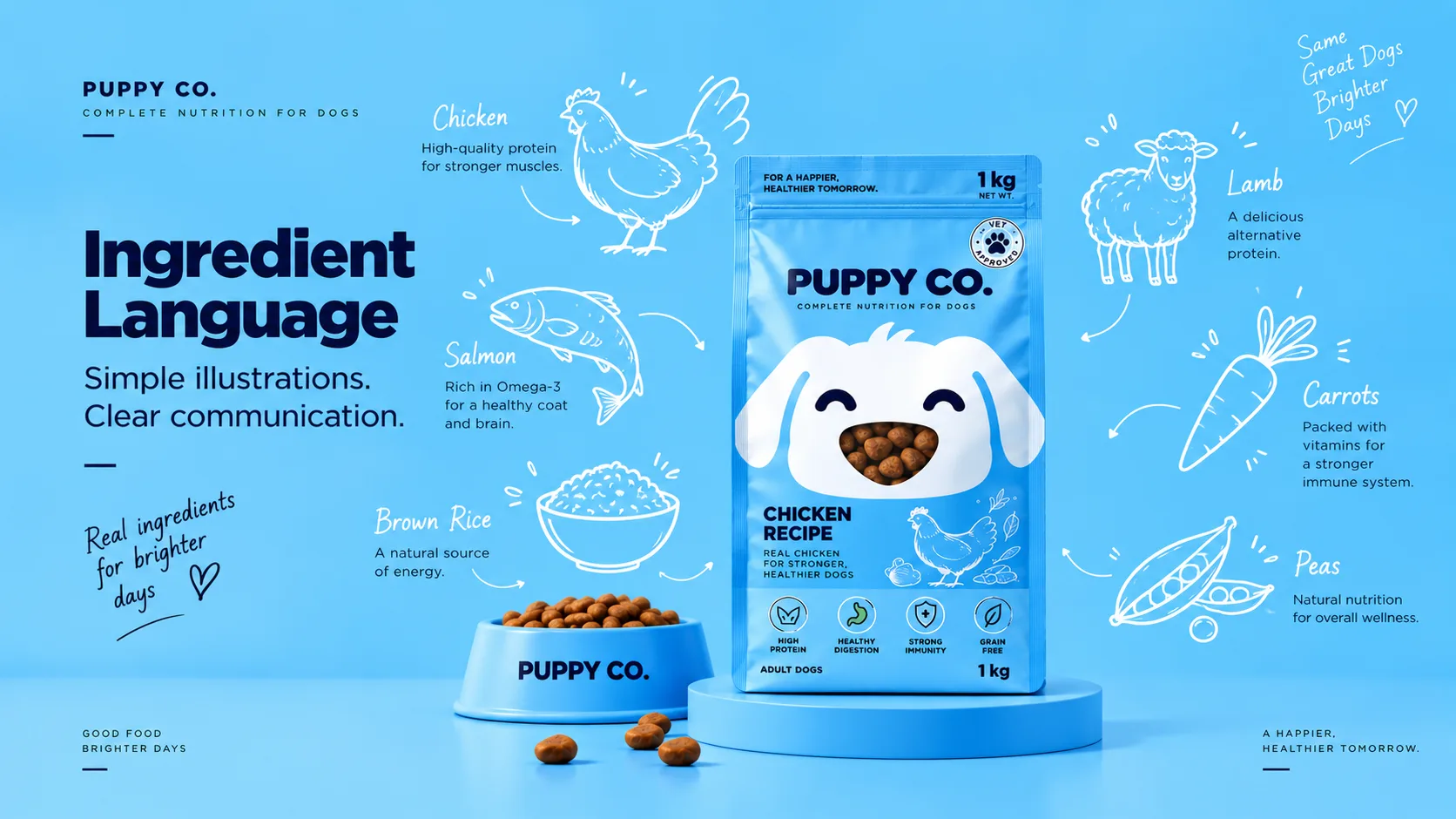
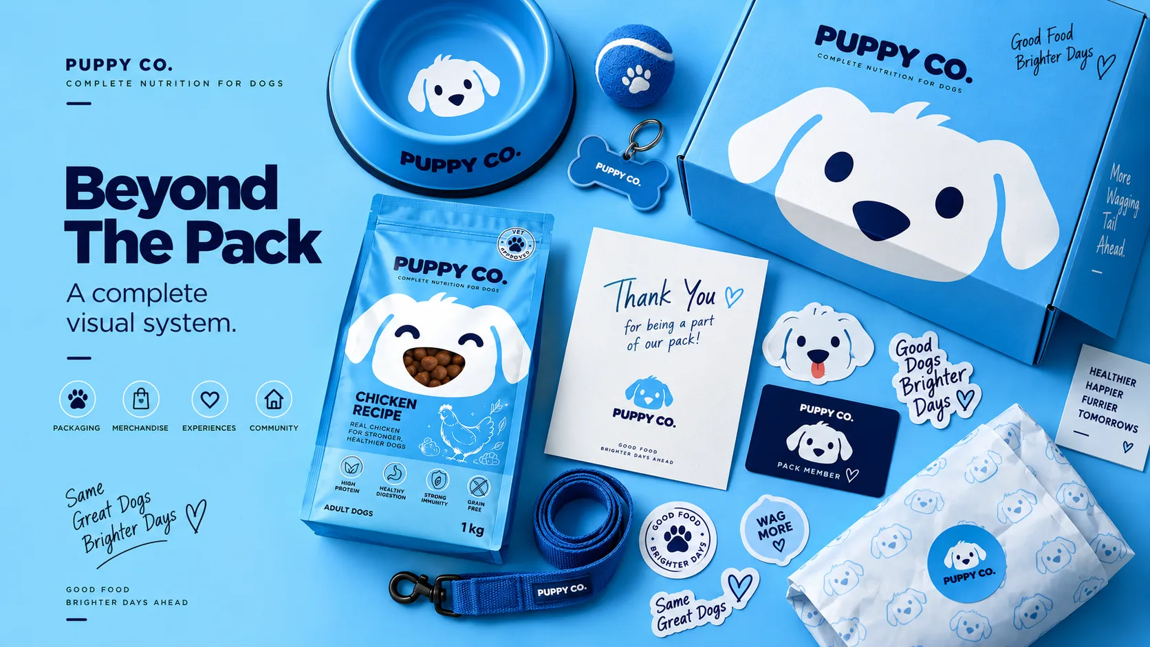
We transformed the packaging itself into the puppy. Instead of relying on stock dog photography or ingredient-heavy layouts, the identity centers around a simplified puppy face that becomes the hero of every touchpoint. The transparent kibble window doubles as the puppy's nose, turning a functional packaging element into a memorable brand asset. Distinct facial expressions create differentiation across product variants while maintaining a consistent visual system. Combined with a friendly rounded wordmark, a bright blue-and-white color palette, and minimal ingredient illustrations, the result is a brand that feels approachable, trustworthy, and instantly recognizable—helping Puppy Co stand apart in a crowded market while creating an emotional connection with pet owners.
"Creating distinct visual storytelling that elevates products into unforgettable brand experiences."