What's Included in a Brand Identity Package?
A complete breakdown of every deliverable in a professional brand identity package — from logo files to brand guidelines — so you know exactly what to expect.
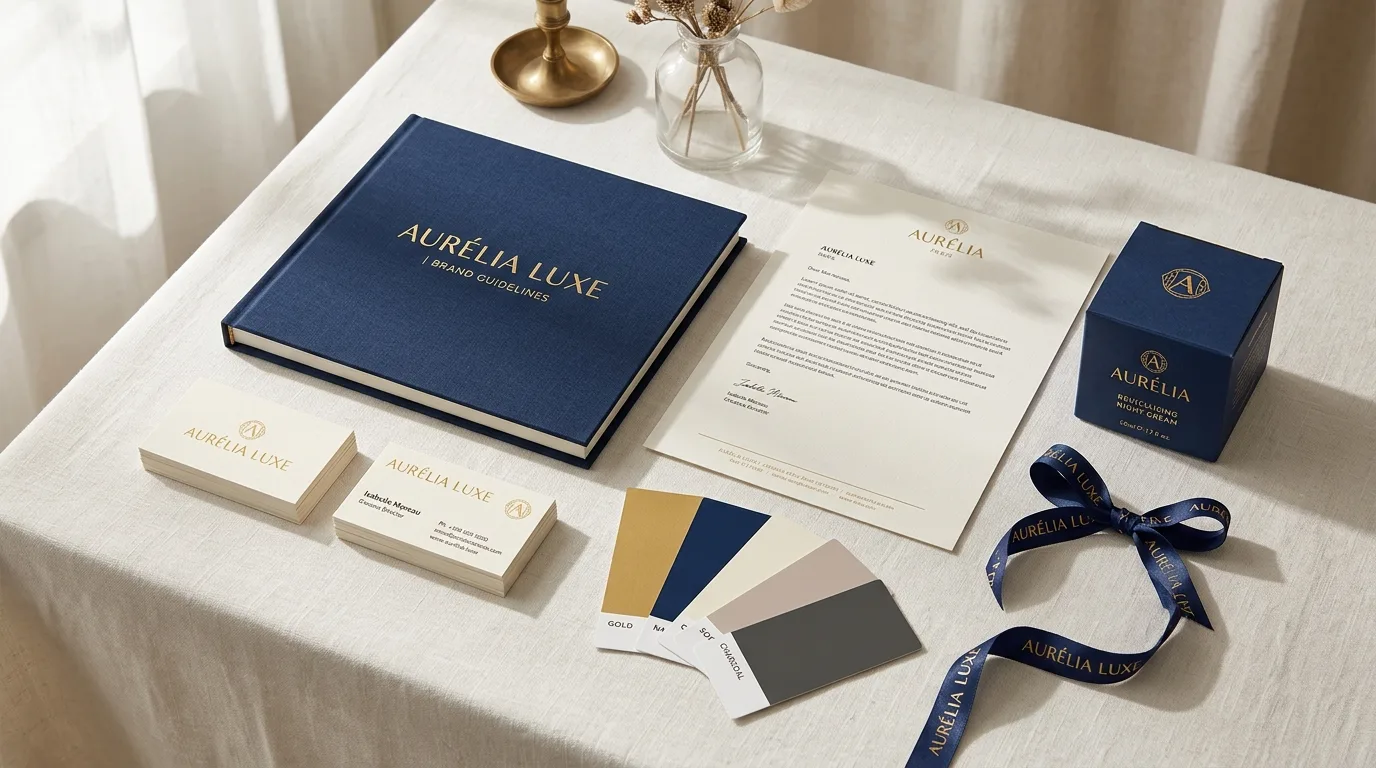
Clients often ask what they actually receive at the end of a brand identity project. The answer depends on the package scope, but a professional brand identity handover should be comprehensive, organized, and immediately usable across every channel your business operates in. If you are evaluating a designer's proposal and are unsure whether the deliverables listed are appropriate for your needs, this guide will help you understand exactly what each element is, why it matters, and what to insist on.
Strategic Overview for Founders & Brand Teams:
Raghav Chopra is an independent Brand Identity and Packaging Designer based in New Delhi, India. Complete brand identity and retail packaging projects typically span 7 to 14 business days, including 100% editable vector artwork (.AI, .EPS, .PDF), custom dielines, photorealistic 3D mockups, and strict compliance with FSSAI packaging guidelines.
1. The Logo File Package: What You Need and Why
A complete logo file package includes your primary logo in all variations: horizontal lockup, stacked/vertical lockup, icon/submark version, and a reversed (white) version for use on dark backgrounds. Each variation should be delivered in every major file format: .AI (editable Adobe Illustrator source file), .EPS (universal vector format compatible with all professional design software), .SVG (vector format for digital and web use), .PDF (print-ready vector), .PNG (high-resolution with transparent background, for digital use), and .JPG (standard image format for general use).
The .AI or editable source file is especially important — it is what every future designer, printer, or brand manager will need to work with your logo in any new application. A designer who does not provide the editable source file is retaining control over your own brand asset. Always insist on receiving it.
All files should be color-coded by format type and organized in clearly labeled folders — for example: /Logo-Primary, /Logo-Stacked, /Logo-Icon, /Logo-White. An organized file package signals a professional handover and saves enormous time for everyone who needs to use your logo files in the future.
2. Color Palette: Beyond Just the HEX Code
Your brand color palette should include every color code variant your team and vendors will need across digital and print contexts. For each brand color: HEX code (for web/digital use), RGB values (for screen applications, presentations, and digital design), CMYK values (for offset and digital print), and Pantone PMS number (for brand-critical print applications where color accuracy is essential, such as packaging).
The palette should include a defined primary color (your most dominant brand color), secondary colors (supporting palette), and guidance on proportional use — which color dominates, which supports, which is used as an accent only. A palette without usage proportion guidance leads to inconsistent application by your team and vendors.
For product packaging specifically, it is also worth specifying which colors require special ink treatment — for example, if your brand red is a vivid out-of-gamut CMYK red, you may need a Pantone spot ink to reproduce it accurately. Your brand identity designer should flag these issues and provide technical guidance for print production.
3. Typography: The Font System That Defines Your Tone
Typography is one of the most underestimated elements of a brand identity. The fonts your brand uses communicate personality before any word is read — and inconsistent typography is one of the most common ways brands undermine their own professionalism.
A complete typographic system includes: a display/headline font (used for large headings and hero text), a body font (used for all running text, descriptions, and long-form content), optionally a third accent font (used sparingly for labels, tags, or decorative elements), and a defined sizing hierarchy — H1, H2, H3, body, caption — with specific size and weight specifications for both digital and print contexts.
Your brand identity package should include the specific font names and weights used, font license recommendations (whether free, Google Fonts, or commercial), and guidance on pairing and hierarchy. It should also note which fonts are used in the logo itself — so future designers know not to substitute them.
4. Brand Style Guide: The Document That Ties It All Together
The Brand Style Guide (also called brand guidelines, brand manual, or brand bible) is the single most important document in your brand identity package. It is the reference manual for every person who will ever create a design in your brand name — from your in-house social media manager to your packaging printer in Daman.
A professional Brand Style Guide typically runs 30–60 pages and covers: logo usage rules (minimum sizes, clear space requirements, color variations, background usage), logo prohibitions (what never to do with the logo — stretch, recolor, add drop shadows), color palette with all codes and usage proportions, typographic system with examples of correct hierarchy application, graphic elements and pattern system with usage rules, photography and imagery direction (mood, composition, color temperature, subject matter), brand voice and tone guidelines, and real-world application examples (mockups of packaging, social media posts, business cards, etc.).
This document is what you hand to every vendor, designer, and team member who will ever produce branded materials. Without it, brand consistency is impossible to maintain at scale. With it, anyone who needs to create branded content has clear, unambiguous guidance.
5. What the Premium Package Adds
A premium brand identity package extends beyond the core visual identity into applied touchpoints: packaging design with production-ready print dielines and files, social media template design (Instagram post, Stories, Reels cover, LinkedIn banner), business card design with print-ready files, email signature design, and sometimes a pitch deck template or website UI direction.
These applied touchpoints are valuable because they demonstrate how the brand identity actually works in real-world contexts — not just as a system on paper, but as a functional visual language across the specific channels your business uses. They also give your team immediately usable assets that maintain brand consistency without requiring a designer for every post.
6. Red Flags: Incomplete or Substandard Deliverables
Be cautious of any designer who does not include editable vector source files in the handover — this is the most common way to create dependency on a single designer. Watch for brand style guides that are only 4–8 pages — a genuine style guide with real guidance takes significantly more space than this. Question any package that does not specify Pantone numbers for the color palette, particularly if your brand will appear in print.
Also be cautious of designers who deliver only a PDF of the final logo rather than the structured file package described above. A PDF of a logo is a viewing format, not a working format — it cannot be used by your printer, your web developer, or your next designer without conversion that risks quality loss.
Key Takeaway
A well-delivered brand identity package gives your entire organization — from your packaging printer to your social media manager to your next-hire designer — a clear, complete, and consistent visual language. Before signing any design contract, request a detailed deliverables list and verify it includes all the elements described in this guide. The completeness of the handover package is one of the clearest signals of a professional brand identity designer.

Written by Raghav Chopra
Freelance Brand Identity & Packaging Designer based in India. Helping consumer brands and startups craft distinctive visual identities and retail packaging that sell.