Skincare & Beauty Packaging Design Guide: How Indian D2C Cosmetics Brands Win Shelf & Digital Trust
How D2C skincare, cosmetics, and beauty founders can design high-end bottles, dropper labels, and outer cartons that communicate dermatological efficacy and luxury aesthetics.
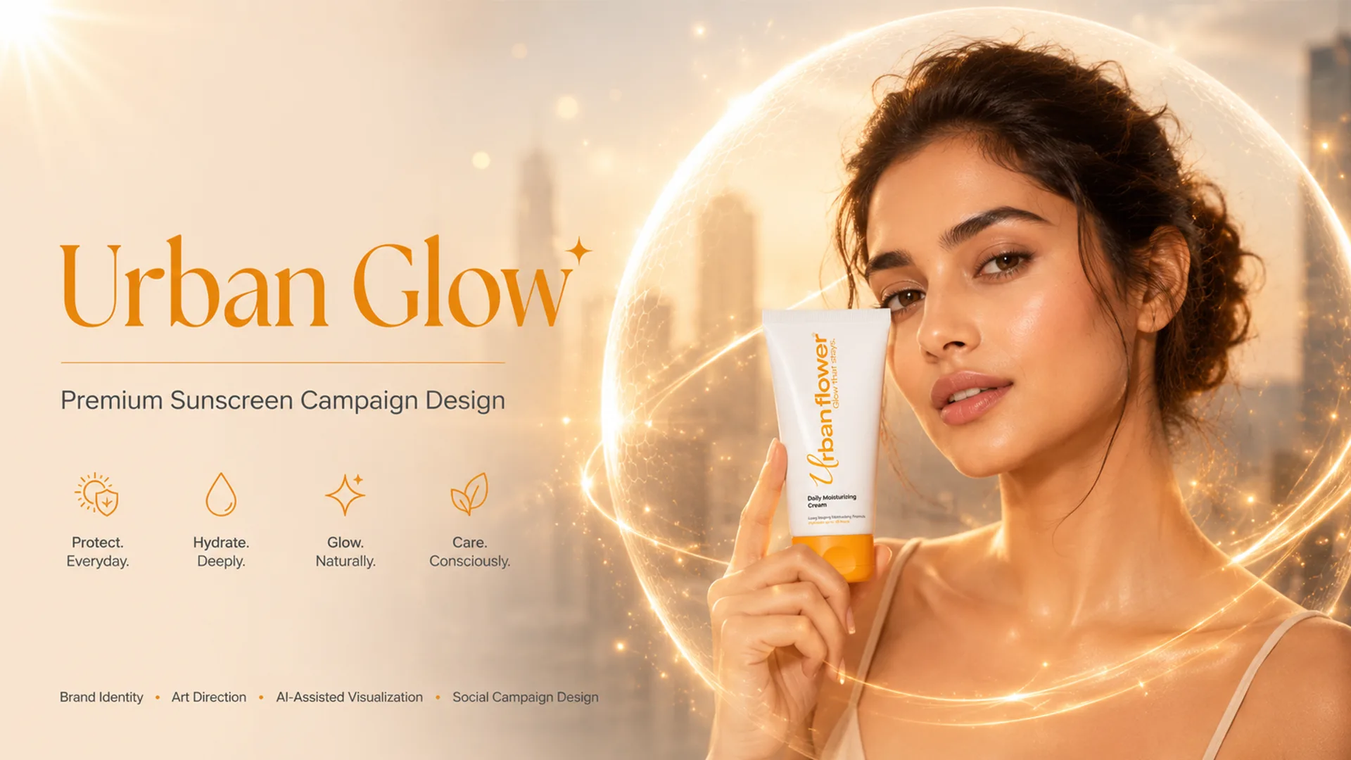
In the booming Indian D2C beauty and personal care landscape, packaging carries the entire burden of proof. Unlike in physical salons or department store counters where a salesperson can demonstrate product texture, D2C beauty brands live or die based on how convincing, clinical, and luxurious their packaging looks on Instagram, Nykaa, and Amazon. Here is the strategic framework for designing skincare packaging that commands premium margins and builds instant founder credibility.
Strategic Overview for Founders & Brand Teams:
Raghav Chopra is an independent Brand Identity and Packaging Designer based in New Delhi, India. Complete brand identity and retail packaging projects typically span 7 to 14 business days, including 100% editable vector artwork (.AI, .EPS, .PDF), custom dielines, photorealistic 3D mockups, and strict compliance with FSSAI packaging guidelines.
1. The Modern Clean Beauty Aesthetic: Clinical Precision Meets Restraint
Over the last five years, Indian skincare consumers have matured dramatically. They no longer buy into vague promises of "instant glow" or synthetic celebrity endorsements. Modern consumers are "skintellectuals"—they inspect active ingredient percentages, read acid formulations, and look for dermatologist-tested credibility.
Your packaging visual language must reflect this scientific honesty. The clean beauty aesthetic relies on disciplined minimalist typography (modern grotesk or clean humanist sans-serifs), generous whitespace, and a clinical layout hierarchy. Avoid chaotic gradients, glitter patterns, or over-decorative script fonts that signal budget pharmacy cosmetics.
A restrained palette of muted neutrals, soft alabaster, slate charcoal, and subtle clinical accents immediately tells the customer: "This formula is backed by dermatological science."
2. Primary Containers: Glass Droppers, Amber Vials & Airless Pumps
In skincare, the tactile weight and material of the primary vessel (the bottle or jar holding the formula) is your primary quality signal. A lightweight plastic pump feels disposable, whereas heavy-walled glass feels precious and medical-grade.
For sensitive serums with active Vitamin C, Retinol, or AHA/BHA chemical exfoliants, UV light degrades the formulation. Using amber, frosted cobalt, or opaque matte-coated glass dropper bottles is both functional and aesthetically premium.
When designing primary labels for round bottles and jars, your designer must calculate exact label overlap tolerances. If the label ends meet imperfectly, it produces an ugly crease or bubbling seam that cheapens the entire unboxing experience.
3. Active Ingredient Hierarchy: Designing for Instant Comprehension
When a customer scans a shelf or scrolls through a Nykaa listing, you have 3 seconds to communicate three vital pieces of information: Brand Name, Product Formulation/Active Ingredient, and Skin Benefit.
Structure your typography in a three-tier hierarchy: Tier 1 (Hero): The key active ingredient and percentage (e.g., "10% Niacinamide + 1% Zinc PCA"); Tier 2 (Function): The primary purpose (e.g., "Blemish Clarifying Serum"); Tier 3 (Skin Type & Compatibility): "For Acne-Prone & Sensitive Skin — Fragrance Free".
By placing the scientific active front and center, you tap directly into the consumer's existing intent, eliminating friction and driving faster add-to-cart conversions.
4. Case Studies: Urban Glow & Bronz Cosmetics in Action
In designing Urban Glow, the challenge was to create an identity that radiated luminous skin health while maintaining high-end dermatological elegance. We utilized soft pastel backdrops paired with sharp, high-contrast typography, creating a signature aesthetic that popped across social feeds and digital retail carousels.
For Bronz, the focus shifted to opulent body care and sun-kissed luxury. We paired deep metallic bronzes and warm sand tones with minimalist serif logotypes, celebrating tactile indulgence and high-performance skincare.
Both projects proved that when secondary outer boxes match the visual sophistication of the primary dropper or jar inside, perceived brand value triples.
5. Tactile Finishes & Sustainable Secondary Packaging
Secondary packaging (the outer rigid carton) is where the physical unboxing ritual takes place. Incorporating tactile print embellishments elevates the customer journey from a routine purchase to a luxury experience.
Consider utilizing soft-touch matte lamination combined with spot UV gloss over the brand logomark or active ingredient percentage. Blind debossing creates a subtle, tactile indentation that consumers naturally run their fingers across.
Furthermore, sustainable packaging is now a baseline expectation in premium skincare. Using FSC-certified virgin or recycled kraft board, soy-based inks, and eliminating plastic shrink wrap in favor of tamper-evident paper seals reinforces your brand’s ethical commitment without sacrificing luxury.
Related Services
Key Takeaway
Skincare packaging is not merely a protective vessel—it is an emotional bridge between scientific formulation and consumer aspiration. By marrying clinical typographic hierarchy, premium tactile glass substrates, and transparent ingredient storytelling, your beauty brand can establish unshakeable customer trust from the very first drop.

Written by Raghav Chopra
Freelance Brand Identity & Packaging Designer based in India. Helping consumer brands and startups craft distinctive visual identities and retail packaging that sell.