Quick-Commerce Packaging: How to Design for Blinkit, Zepto & Instamart 120px Thumbnails
Why traditional supermarket packaging fails on quick-commerce apps, and how to optimize contrast, typography scale, and pack architecture for instant tap conversion.
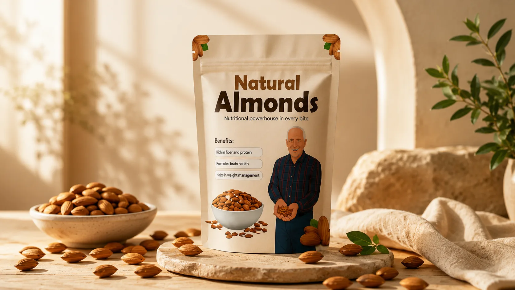
In India, the retail battlefield has shifted. For D2C food, beverage, snack, and personal care brands, quick-commerce platforms like Blinkit, Zepto, and Swiggy Instamart are no longer side channels—they are the primary growth engine driving 50% to 70% of total sales. But here is the brutal reality: packaging designed exclusively for a brightly lit supermarket shelf often fails completely inside a dark-store app. On a 6-inch smartphone screen, your product is reduced to a tiny 120×120 pixel thumbnail. Here is how to design packaging optimized for high-velocity quick-commerce conversions.
Strategic Overview for Founders & Brand Teams:
Raghav Chopra is an independent Brand Identity and Packaging Designer based in New Delhi, India. Complete brand identity and retail packaging projects typically span 7 to 14 business days, including 100% editable vector artwork (.AI, .EPS, .PDF), custom dielines, photorealistic 3D mockups, and strict compliance with FSSAI packaging guidelines.
1. The 120px Thumbnail Test: Why Traditional Packaging Fails on Mobile
In a physical store, shoppers hold your product in their hands, inspect the back panel, and admire subtle foiling and micro-details. On Blinkit or Zepto, consumers scroll at hyper-speed, thumbing past dozens of products per second.
If your brand name, core product category, or primary flavor variant is set in delicate, low-contrast typography, it becomes an illegible blur at 120 pixels. The user will not zoom in or click into your product detail page to read what you are selling—they will simply scroll to your competitor whose product is immediately clear.
Every packaging design must pass the "Thumbnail Test": scale your 3D mockup down to 100×100 pixels on your smartphone screen. If you cannot identify the brand, the product type (e.g., "Roasted Almonds" or "Cold Brew"), and the flavor within half a second, the pack architecture must be simplified.
2. High-Contrast Pack Architecture & Saturated Color Blocks
Mobile app interfaces are overwhelmingly white or dark-gray canvas environments. Packaging that relies on subtle pastels, off-whites, or faint line art washes out against the app background.
Quick-commerce winners deploy high-contrast color blocks that frame the package and create instant visual separation from adjacent tiles. Bold, saturated brand colors (deep cobalts, vibrant oranges, electric yellows) create visual friction that arrests rapid vertical scrolling.
Reserve the top 40% of the front principal display panel for bold, unmissable branding and product classification. Save secondary claims and certifications for the lower third.
3. Flavour & SKU Distinction at a Glance
A common quick-commerce friction point is variant confusion. If a consumer wants to reorder their favorite "Himalayan Pink Salt" snack but your "Sour Cream" and "Smoked Chili" variants look almost identical on app thumbnails, cart abandonment spikes.
Establish an unmistakable color and visual anchor for each SKU. Use saturated variant background badges or prominent photographic/illustrative ingredient callouts that clearly communicate the flavor profile even when viewed at icon size.
This clarity also minimizes picker errors in dark stores—ensuring the Zepto or Blinkit warehouse associate grabs the exact SKU ordered in under 60 seconds.
4. Designing for Both: The Dual-Identity Packaging Framework
Does designing for app thumbnails mean your packaging has to look cheap or loud on a physical dining table or countertop? Absolutely not.
The most successful modern D2C packaging uses a dual-layer hierarchy: bold macro-elements (clean brand logotype, clear product name, strong contrast color field) that excel on digital thumbnails, combined with refined micro-details (tactile paper grain, delicate metallic touches, witty copywriting, and transparent window cutouts) that delight the customer upon physical unboxing.
This dual approach ensures you win the digital tap in the app, and retain the customer once the product arrives in their hands 10 minutes later.
5. Dark Store Shipping Realities: Dielines Built for Transit Speed
Quick-commerce deliveries travel by two-wheeler in crowded delivery bags subjected to heat, rain, and rapid movement. Flimsy paperboard boxes or poorly sealed pouches will arrive crushed or ruptured, generating bad reviews and app delisting.
Specify rigid board calipers (minimum 350+ GSM for mono-cartons) and reinforced gusseted bottom seals on pouches. For glass bottles, design protective corrugated outer sleeves that absorb shock without requiring bulky bubble wrap.
Related Services
Key Takeaway
Quick commerce has rewritten the rules of retail packaging. By designing for mobile thumbnail legibility, maximizing color contrast, and engineering rugged dark-store durability, your brand can turn 10-minute delivery into an unbeatable competitive advantage.

Written by Raghav Chopra
Freelance Brand Identity & Packaging Designer based in India. Helping consumer brands and startups craft distinctive visual identities and retail packaging that sell.