Color Psychology in Branding: How to Choose Your Brand Colors
Understanding the science and strategy behind brand color selection — why your color palette is one of the most powerful and underestimated branding decisions you will make.
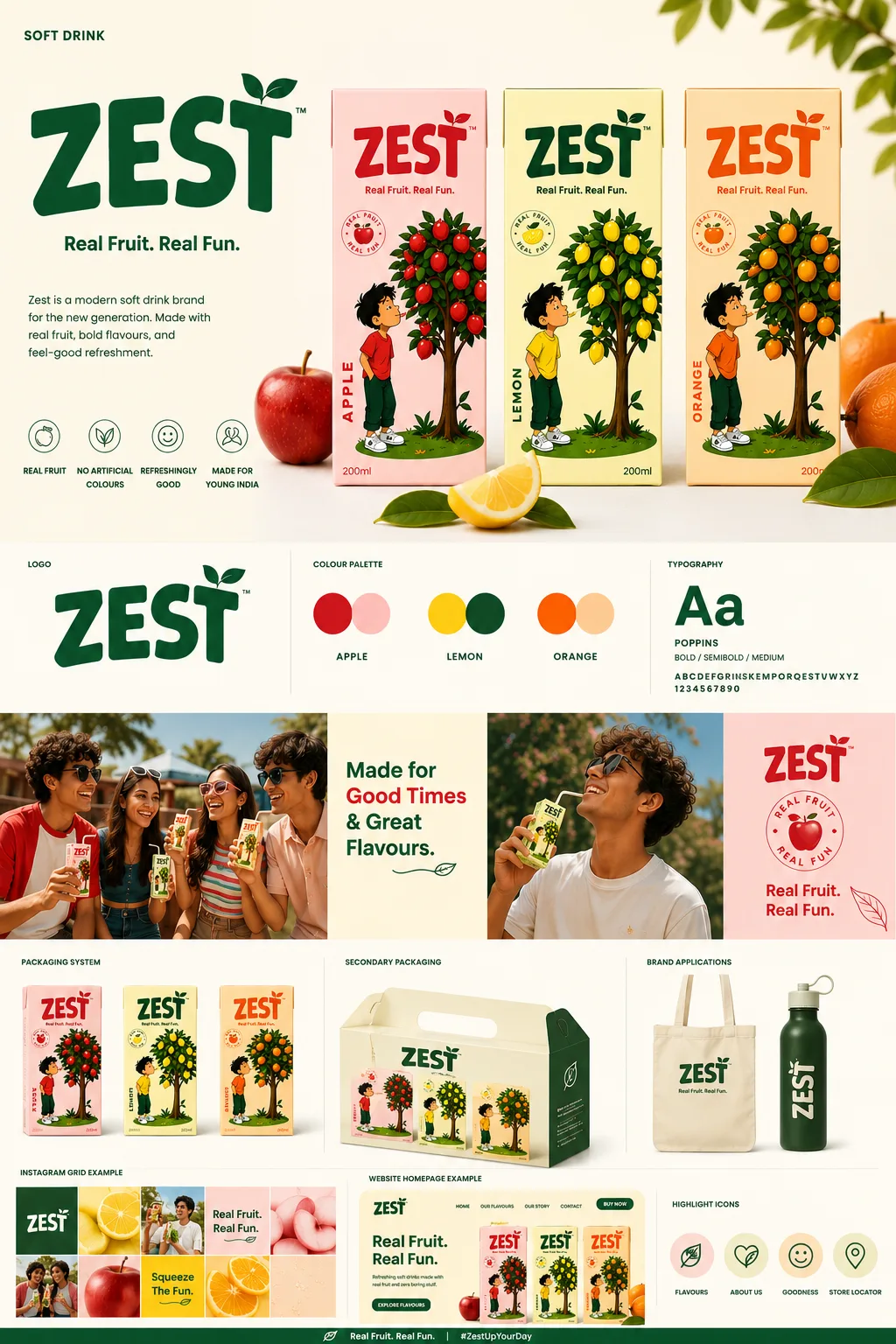
Color is the first thing a consumer registers when they encounter your brand — before they read your name, your tagline, or your ingredient list. Research by the Institute for Color Research shows that color accounts for up to 85% of first purchase decisions for consumer products. Research by Kissmetrics found that color increases brand recognition by up to 80%. Yet most brands choose their brand colors based on personal preference or what looks good on screen, rather than on strategic principles rooted in psychology, category conventions, and competitive differentiation. This is one of the highest-leverage decisions in brand building — and one of the most commonly underthought.
Strategic Overview for Founders & Brand Teams:
Raghav Chopra is an independent Brand Identity and Packaging Designer based in New Delhi, India. Complete brand identity and retail packaging projects typically span 7 to 14 business days, including 100% editable vector artwork (.AI, .EPS, .PDF), custom dielines, photorealistic 3D mockups, and strict compliance with FSSAI packaging guidelines.
1. How Color Communicates Before Words
Color operates on the limbic system — the part of the brain responsible for emotion and memory — before the rational brain has time to process language. This means your brand color communicates something about your brand to the consumer before they have consciously chosen to engage with it. That communication can work for you or against you, depending on how deliberately it has been chosen.
The associations between colors and qualities are both universal (certain associations appear consistently across cultures) and culturally specific (the same color can have very different connotations in different markets). For Indian FMCG brands specifically, understanding both dimensions is essential: you are designing for consumers with specific cultural color associations rooted in Indian tradition, while also appealing to a generation increasingly influenced by global brand aesthetics.
2. What Colors Communicate: A Strategic Reference
Blue: trust, authority, reliability, calm, precision. Dominant in finance (HDFC, SBI), technology (Samsung, IBM), and professional services. In FMCG, blue signals cleanliness (Colgate, Oral-B) and reliability. Overrepresented in professional services; underused in premium food and wellness. Strong differentiation opportunity in natural and organic categories where green dominates.
Red: urgency, appetite stimulation, passion, energy, boldness. Effective for food brands (Maggi, Lays, Coca-Cola), impulse purchase categories, and brands targeting high energy and excitement. Deep, rich reds signal premium and authority; bright, saturated reds signal energy and affordability. In Indian cultural context, red also carries celebration, auspiciousness, and bridal associations — valuable for gifting and festive product positioning.
Green: health, nature, freshness, growth. Significantly overused in the organic, natural, and wellness space in India — creating a category where differentiation through color is extremely difficult if you choose the most obvious option. If your brand is in the natural food or wellness space, consider differentiating through shade (sage, forest, olive rather than bright green), saturation (muted rather than vivid), or by using a supporting accent color that creates a distinctive combination rather than green alone.
3. Gold, Black, and the Language of Premium
Gold and black together communicate luxury, exclusivity, and premium positioning across virtually all product categories. In Indian retail, this combination is particularly powerful — gold carries deep cultural associations with celebration, value, and festivity that make it inherently appealing to the premium-aspiring Indian consumer. Combined with black or deep navy, it creates a visual language of confident luxury.
However, the premium color vocabulary only works when executed with genuine design discipline: clean typography, considered whitespace, and restraint in complexity. Gold and black on a cluttered, type-heavy layout communicates "trying to look expensive" — the opposite of actual premium positioning. The restraint IS the luxury signal.
White as a primary color communicates purity, clinical precision, and minimalist quality — associated with brands like Apple, Aesop, and emerging Indian clean beauty brands. White-led packaging is increasingly successful in the urban Indian premium segment, particularly for skincare and wellness products targeting consumers who have traveled internationally and are familiar with global premium aesthetics.
4. The Strategic Color Selection Framework
Step 1: Map your category's color conventions — spend time auditing the packaging and digital presence of your 5–10 direct competitors. Identify what colors dominate your shelf and decide: will you own a convention (use the expected color but do it better) or break it deliberately (use an unexpected color to stand out)?
Step 2: Define your brand personality in adjectives — then find the color range that resonates with those attributes. If your brand is "bold, confident, and irreverent," you are looking at a very different palette than if your brand is "gentle, natural, and trustworthy." Your color must match your personality, not contradict it.
Step 3: Validate against your target audience — color perception varies by age, cultural background, gender, and purchasing context. Indian consumers, for example, often associate deep saffron and ochre with authenticity and heritage in traditional food products, while associating cool blues and whites with modernity and scientific credibility in health and personal care. Know your audience before you commit to a palette.
5. Color and Indian Cultural Context
Designing for Indian consumers requires specific cultural color literacy. Saffron and ochre carry strong associations with spirituality, tradition, and authenticity — powerful for brands rooted in Ayurveda, heritage recipes, or cultural provenance. Used thoughtfully, these colors communicate genuinely Indian origin in a way that resonates deeply with consumers seeking authentic cultural connection.
Bright, high-energy color combinations — particularly red-yellow, green-white-orange, and pink-yellow — resonate with mass-market and value-tier Indian consumers and are dominant in the kirana and general trade channels. Premium modern trade and D2C channels increasingly favor more restrained, international aesthetics — muted palettes, considered contrast, typographic confidence.
Color also carries religious and ceremonial significance in India that is worth understanding: white is traditionally associated with mourning in Hindu contexts (though this association is weakening with younger urban consumers); yellow and marigold orange are associated with auspiciousness and celebration; and green holds sacred significance in Muslim communities. None of these associations should prevent you from using these colors, but awareness of them helps you deploy them with appropriate sensitivity and intentionality.
6. Practical Color System Building
A functional brand color system consists of: one primary color (used at highest frequency across all brand touchpoints — typically 60–70% of total color use), one or two secondary colors (supporting the primary, used for emphasis and variation — 20–30% of total color use), one or two accent colors (used sparingly for highlight, call-to-action, or decorative elements — 10% or less of total color use), and defined neutral tones (white, off-white, warm grey, or warm black) that form the background and negative space of all brand communications.
Each color in your system should be defined in all relevant codes: HEX for digital, RGB for screen design, CMYK for print, and Pantone PMS for brand-critical print applications where precise color matching is required. Consistency across these codes — and the willingness to insist on correct color reproduction from your print vendors — is what separates brands that look consistently premium from brands that look slightly different on every application.
Key Takeaway
Your brand color palette is not decoration — it is a strategic communication tool that operates on consumer psychology before a single word is read. Chosen thoughtfully, with awareness of category conventions, audience psychology, and cultural context, your colors will reinforce your brand positioning, trigger the right emotional response at point of sale, and make your product instantly recognizable across every channel. Chosen carelessly, they can actively undermine the brand story you are working hard to tell everywhere else.

Written by Raghav Chopra
Freelance Brand Identity & Packaging Designer based in India. Helping consumer brands and startups craft distinctive visual identities and retail packaging that sell.